“Our site is beautiful. But conversion rates are terrible.”
I looked at the site. They were right—it was gorgeous.
Large hero images. Lifestyle photography. Minimalist aesthetic. Lots of whitespace.
Then I tried to buy something.
Couldn’t find the product I wanted in under 3 minutes.
Gave up.
This is the problem with most e-commerce sites: They’re designed like magazines, not stores.
After 18 years of optimizing e-commerce experiences—including redesigning PetSmart.com—I’ve learned: Beautiful doesn’t mean effective. Conversion happens when you make buying easy, not when you make browsing pretty.
Here’s the difference.
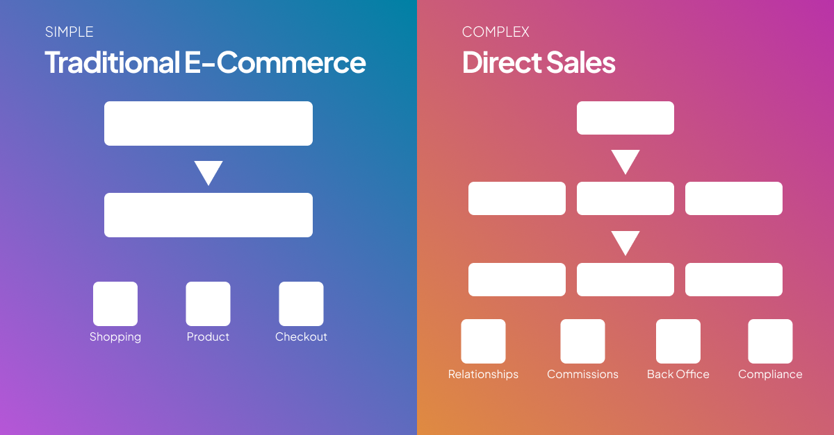
The Magazine vs. Store Problem
Sites Designed for Browsing (Like Magazines):
Priorities:
- Beautiful imagery
- Lifestyle inspiration
- Brand storytelling
- Editorial layouts
- Emotional connection
User behavior assumed:
- Casual exploration
- Inspiration seeking
- Time to spare
- No specific goal
Works great for:
- Brand building
- Social media content
- Editorial content
- Aspiration
Terrible for:
- Actually buying things
- Finding specific products
- Completing tasks efficiently
- Returning customers who know what they want
Sites Designed for Buying (Like Stores):
Priorities:
- Clear navigation
- Efficient product discovery
- Quick path to purchase
- Information at the ready
- Frictionless checkout
User behavior assumed:
- Goal-oriented
- Limited time
- Specific needs
- Want to complete purchase quickly
Works great for:
- Conversions
- Repeat purchases
- Customer satisfaction
- Revenue
Real Example: Comparing Approaches
Client: Premium Kitchen Equipment E-Commerce
Version 1: Designed for Browsing
Homepage:
- Large lifestyle image (couple cooking together, product barely visible)
- “Inspired cooking” headline
- Scroll to see products
- Featured collection: “Fall favorites” (seasonal inspiration)
Product listing:
- Large images (one product per row on desktop)
- Minimal product info visible
- Must click to see price, specs
- Lots of whitespace
Product page:
- Multiple lifestyle images
- Long brand story
- Specs buried below fold
- “Add to cart” button not always visible
Results:
- Bounce rate: 68%
- Average session duration: 1:47
- Conversion rate: 1.8%
- Revenue: $43K/month
User feedback (from exit surveys):
- “Couldn’t find what I was looking for”
- “Took too long to browse products”
- “Couldn’t tell if you had what I needed”
Version 2: Designed for Buying
Homepage:
- Clear value proposition: “Professional-grade kitchen equipment for home cooks”
- Prominent search bar
- Category navigation visible
- Featured: “Best sellers” and “New arrivals” (practical, not seasonal)
- Quick links: “Shop by brand” “Sale items”
Product listing:
- Grid layout (4 products per row on desktop)
- Key info visible: product name, price, rating, key feature
- Quick view option (see details without leaving page)
- Filters prominent (price, brand, rating, features)
Product page:
- Product images + quick specs visible above fold
- “Add to cart” button fixed in view
- Tabs for: Specs, Reviews, Q&A, Shipping
- “Frequently bought together” suggestions
- Clear return policy
Results:
- Bounce rate: 41% (-40%)
- Average session duration: 3:24 (+94%)
- Conversion rate: 4.7% (+161%)
- Revenue: $89K/month (+107%)
User feedback:
- “Easy to find what I needed”
- “Quick checkout process”
- “All the information I needed to decide”
The Seven Mistakes “Browsing Sites” Make
Mistake #1: Hiding Products Behind Inspiration
Browsing approach:
- Homepage is brand story and lifestyle imagery
- Products 3-4 scrolls down
- Focus on feeling, not function
Buying approach:
- Homepage shows products immediately
- Clear categories
- Search prominent
- Get users to products in one click
Real data from a client:
Before (inspiration-heavy homepage):
- 43% of visitors never saw products
- Average clicks to product page: 4.2
- Homepage bounce rate: 61%
After (product-forward homepage):
- 89% of visitors clicked into products
- Average clicks to product page: 1.8
- Homepage bounce rate: 34%
- Conversion rate: +54%
Lesson: People came to buy, not to be inspired.
Mistake #2: Inefficient Product Discovery
Browsing approach:
- Large images, one or two products per row
- Minimal information visible
- Must click into each product to see details
- No comparison capability
Buying approach:
- Grid layouts showing multiple products
- Key info visible at a glance (price, rating, key feature)
- Quick view for details without navigation
- Easy comparison
Real example:
Before (one product per row):
- 6 products visible above fold
- Average time to find desired product: 4:12
- Product pages viewed before purchase: 8.3
After (grid layout, 12 products above fold):
- 12 products visible above fold
- Average time to find desired product: 1:37
- Product pages viewed before purchase: 3.1
- Conversion rate: +37%
More products visible = faster discovery = higher conversion.
Mistake #3: Poor Search Functionality
Browsing approach:
- Search hidden or de-emphasized
- Basic keyword matching
- Poor results for misspellings or synonyms
- No filters on search results
Buying approach:
- Search prominent (top of every page)
- Smart search (handles misspellings, synonyms)
- Autocomplete with suggestions
- Rich filters on results
- Sort options (price, rating, relevance)
Real client data:
Users who use search:
- Convert 3-4x higher than those who don’t
- Have 2-3x higher average order value
- Are more likely to be repeat customers
Yet most sites treat search as an afterthought.
What we fixed:
- Made search 3x larger and more prominent
- Added autocomplete
- Improved search algorithm (handled synonyms, misspellings)
- Added filters to search results
Results:
- Search usage: 12% → 38% of visitors
- Search conversion rate: 8.2% (vs. 2.1% for non-search users)
- Revenue from search traffic: +$23K/month
One of the highest-ROI improvements possible.
Mistake #4: Vague or Missing Product Information
Browsing approach:
- Lifestyle descriptions
- Emotional language
- Specs hidden or incomplete
- No comparison capability
Buying approach:
- Clear, specific information
- Detailed specs readily available
- Multiple views/angles
- Comparison tools
- User reviews
- Q&A section
What buyers need to know:
Before purchase:
- Does this product do what I need?
- How does it compare to alternatives?
- What do other customers think?
- What are the specs/dimensions/materials?
- How much does it cost (including shipping)?
- When will I get it?
- Can I return it?
If any of these are unclear, conversion drops.
Real example:
Product page conversion rate by information completeness:
| Info Quality | Conversion Rate |
|---|---|
| Minimal (image, price, short description) | 1.2% |
| Basic (+ specs, reviews) | 2.8% |
| Good (+ multiple images, detailed specs, Q&A) | 4.1% |
| Excellent (+ comparison, videos, size guide) | 6.3% |
More complete information = 5x higher conversion.
Mistake #5: Weak Filtering and Navigation
Browsing approach:
- Browse by collection or aesthetic
- Limited filtering
- Vague categories
- No clear path to specific products
Buying approach:
- Multiple navigation paths
- Robust filtering (price, features, brand, rating)
- Clear, specific categories
- Breadcrumbs showing where you are
Real example: Fashion E-Commerce
Before (browsing-focused):
- Categories: “New Arrivals” “Trending” “Collections”
- No filtering by size, color, price
- Can’t shop by specific garment type easily
After (buying-focused):
- Categories: “Women” → “Tops” → “T-Shirts” (specific)
- Filters: Size, Color, Price, Brand, Style, Material
- Sort: Price, Rating, Newest, Best Selling
- Quick filters: “Under $50” “In Stock” “Free Shipping”
Results:
- Time to find desired product: -58%
- Filter usage: 67% of users
- Conversion among filter users: 7.2% (vs. 2.1% non-filter)
- Cart abandonment: -31%
Clear navigation isn’t sexy. But it converts.
Mistake #6: Slow Path to Purchase
Browsing approach:
- Must click product → read description → scroll for specs → find add to cart → view cart → checkout
- 6+ steps to purchase
Buying approach:
- Quick add from listing pages
- Sticky “Add to cart” button
- “Buy now” option (skip cart)
- One-click reorder for returns
- Saved payment info
Real data:
Each additional click to purchase = ~10% drop in completion
Reduce friction at every step.
Example improvements:
| Feature | Impact |
|---|---|
| Quick add from grid | Reduce clicks from 5 to 3 |
| Sticky CTA on product page | Always visible |
| Buy now button | Skip cart, go to checkout |
| One-click reorder | Instant purchase |
Mistake #7: Treating All Visitors the Same
Browsing approach:
- Same experience for everyone
- New and returning customers see identical site
- No personalization
Buying approach:
- Recognize returning customers
- Show recently viewed
- Suggest based on browsing history
- Enable quick reorder
- Remember preferences
Real example:
Returning customers (40% of traffic) behavior:
- Know what they want
- Want to buy quickly
- Likely to reorder previous purchases
- Don’t need brand storytelling
New customers (60% of traffic) behavior:
- Exploring, learning
- Need more information
- Comparing options
- Building trust
Different needs = different optimal experiences.
What we built:
For returning customers:
- Prominent: “Reorder previous purchases”
- Show recently viewed
- Quick add for favorites
- Streamlined checkout (saved payment)
For new customers:
- Prominent: “Best sellers” “Top rated”
- Featured: Reviews and social proof
- Available: Buying guides, comparisons
- Clear: Return policy, guarantees
Results:
- Returning customer conversion: +47%
- New customer trust: +32% (survey data)
- Overall revenue: +$18K/month
How to Audit Your Site
Test 1: The Quick-Buy Test
Pick a specific product you sell.
From homepage:
- Time how long it takes to find and purchase it
- Count how many clicks required
- Note any friction or confusion
Goal:
- Under 60 seconds to find product
- Under 4 clicks to add to cart
- Under 3 minutes to complete checkout
If you’re over these targets, you’re designed for browsing, not buying.
Test 2: The Information Test
For 5 random products, check:
- Are key specs visible without scrolling or clicking?
- Are prices clear (including shipping)?
- Are reviews visible and helpful?
- Are images sufficient to understand product?
- Is stock status clear?
- Is shipping time clear?
If any answer is “no,” you’re making buying harder than it should be.
Test 3: The Search Test
Search for products using:
- Generic terms (“running shoes”)
- Specific terms (“Nike Air Zoom Pegasus 38”)
- Misspellings (“runing shues”)
- Synonyms (“sneakers” vs “tennis shoes”)
Good search handles all of these.
If your search struggles with anything except exact matches, it’s hurting conversion.
Test 4: The Mobile Test
Try to complete a purchase on mobile.
Check:
- Can you find products easily?
- Are filters usable?
- Can you see key info without excessive scrolling?
- Is checkout smooth?
60% of traffic is mobile. If mobile experience is clunky, you’re losing conversions.
The Balance: Beautiful AND Functional
This isn’t “sacrifice beauty for function.”
The best e-commerce sites are both:
- Visually appealing (builds trust and brand)
- Functionally excellent (drives conversions)
Example: Great e-commerce sites that balance both:
What they do right:
- Beautiful product photography (but not at expense of information)
- Clean, modern design (but navigation is clear)
- Brand personality (but doesn’t hide products)
- Emotional connection (but task completion comes first)
The key: Design serves the goal (buying), not the other way around.
The Bottom Line
Most e-commerce sites prioritize:
- Looking good
- Brand storytelling
- Aesthetic inspiration
- Impressive to stakeholders
High-converting e-commerce sites prioritize:
- Easy product discovery
- Complete information
- Frictionless purchase path
- Task completion
You can have both. But when there’s a tradeoff, choose function.
After 18 years of e-commerce optimization, here’s what I know:
Browsers enjoy beautiful sites.
Buyers convert on functional ones.
Your revenue comes from buyers.
Design for buying, not browsing.