“Legal said we have to add a disclaimer. Can you make it… less terrible?”
I’ve had this conversation dozens of times working in direct sales.
The legal team adds:
- Income disclaimers
- Product disclaimers
- Autoship disclosures
- Cancellation policies
- Earnings statements
- FTC-mandated warnings
The result:
- Walls of text
- Interrupted user flows
- Forced scrolls through 40 pages of policies
- Mandatory checkboxes on every page
- Pop-ups with legal warnings
User reaction: “This seems sketchy. I’m out.”
After three redesigns of PlexusWorldwide.com and years working with direct sales compliance teams, I’ve learned: Legal requirements and good UX aren’t mutually exclusive.
You can be compliant AND user-friendly.
Here’s how.
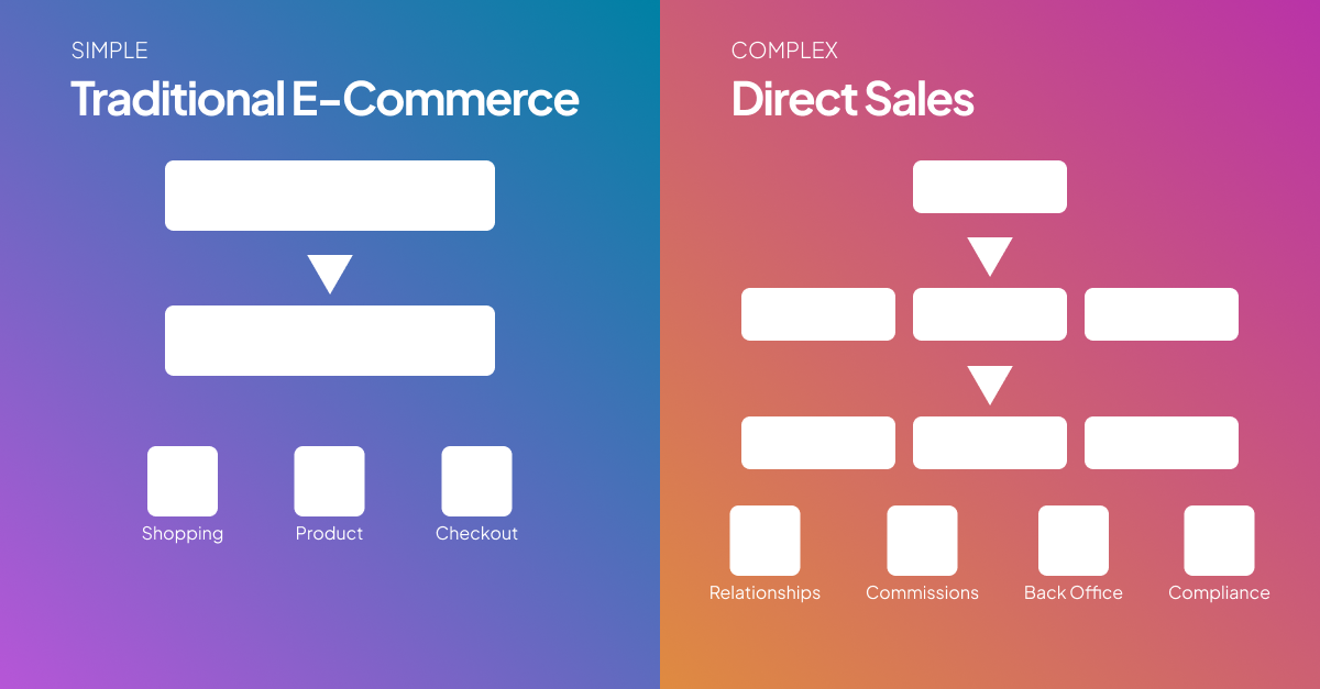
The Compliance Problem in Direct Sales
Why Direct Sales Has Brutal Compliance Requirements:
History of abuse:
- Pyramid schemes disguised as legitimate businesses
- Unrealistic income claims
- Deceptive marketing
- Predatory recruitment
Result: Heavy regulation:
- FTC oversight
- State-by-state regulations
- Required disclosures
- Mandatory warnings
- Income documentation requirements
- Product claim restrictions
All necessary. All terrible for UX.
What Compliance Usually Does to UX:
Real example from a client (before optimization):
Their homepage:
WELCOME TO [COMPANY]

*Income Disclaimer: The income and lifestyle claims made on this website are not typical. Individual results will vary. Most distributors earn little to no income. See our Income Disclosure Statement for detailed earnings information.*

BUILD YOUR BUSINESS

*Business Opportunity Disclaimer: This is not an employment opportunity. You will be an independent contractor. Success requires hard work, dedication, and may require significant time and financial investment. Results not guaranteed.*

AMAZING PRODUCTS

*Product Disclaimer: These statements have not been evaluated by the Food and Drug Administration. These products are not intended to diagnose, treat, cure, or prevent any disease. Individual results may vary.*

[40 more lines of disclaimers, terms, and warnings]
User reaction:
- Bounce rate: 73%
- Average time on site: 23 seconds
- Enrollment starts: Terrible
Why: Looked like a scam, felt overwhelming, buried the actual value.
Compliance was technically correct. But it destroyed conversions.
The Seven Compliance UX Mistakes
Mistake #1: Disclaimers Everywhere, All at Once
What most sites do:
Put every possible disclaimer on every page, all visible at once.
Why legal teams do this: “If it’s not visible, we could get sued.”
Why this kills UX: Nobody reads walls of text. It just creates anxiety.
The fix:
Contextual compliance (right disclosure, right time, right place)
Don’t:
- Put income disclaimers on product pages (not relevant)
- Put product disclaimers on business opportunity pages (not relevant)
- Show everything everywhere
Do:
- Show income disclaimers on income claims pages
- Show product disclaimers on product claims pages
- Show autoship disclosures during enrollment
- Keep it contextual and relevant
Real example:
Before:
- Every page: Income disclaimer, product disclaimer, earnings statement, autoship policy (800+ words total)
- User overwhelm: 100%
- Bounce rate: 71%
After:
Homepage: No disclaimers (none needed - no claims made)
Business opportunity page: Income disclaimer + link to earnings statement
Product pages: Product disclaimers only when making health claims
Enrollment: Autoship disclosure + cancellation policy
Testimonials page: “Results not typical” disclaimer
Results:
- Same legal protection
- Bounce rate: 71% → 42%
- Enrollment starts: +54%
- Legal review: Approved
Show disclaimers where they’re relevant, not everywhere.
Mistake #2: Walls of Legal Text With No Hierarchy
What most sites do:
40 pages of policies and procedures in dense paragraphs with no formatting:
By enrolling as a distributor you agree to the following terms and conditions: You acknowledge that you are an independent contractor and not an employee of the company. You agree to comply with all applicable laws and regulations including but not limited to FTC regulations regarding income claims and product claims. You acknowledge that past performance is not indicative of future results. You understand that the average distributor earns less than $500 per year and that significant time and financial investment may be required to build a successful business. You agree to maintain monthly autoship requirements to remain eligible for commissions...
[continues for 40 pages]
User behavior: Scroll to bottom, click “I Agree” without reading.
Legal protection: None (they didn’t actually read it)
The fix:
Make it scannable, understandable, and hierarchical:
DISTRIBUTOR AGREEMENT

Key Points to Know:

✓ You're an independent contractor (not an employee)
✓ You must maintain monthly autoship to earn commissions
✓ Most distributors earn less than $500/year
✓ Success requires significant time and investment
✓ You can cancel anytime with 30 days notice

[Expand sections below to learn more]

1. ▼ Your Status as Independent Contractor
   [Collapsible section with details]

2. ▼ Monthly Requirements and Costs
   [Collapsible section with details]

3. ▼ Income Potential and Realities
   [Collapsible section with details]

4. ▼ Product Claims and Restrictions
   [Collapsible section with details]

5. ▼ How to Cancel Your Distributorship
   [Collapsible section with details]

[Download full agreement (PDF)]

[ ] I have read and agree to these terms
Better UX:
- Key points visible (most important info)
- Expandable sections (read what matters to you)
- Clear structure (easy to find specific topics)
- Download option (review offline)
Better compliance:
- Users more likely to actually read it
- Key terms not buried
- Informed consent (legally stronger)
Real results:
Before (wall of text):
- Time spent on policy page: 12 seconds average
- Estimated users who read it: <3%
- Complaints “I didn’t know about that”: Frequent
After (structured):
- Time spent: 2:18 average
- Section expansion rate: 47% of users
- Complaints “I didn’t know”: -81%
Structured compliance = better informed users = better legal protection
Mistake #3: Hiding Critical Info in Fine Print
The worst approach: Making required disclosures technically present but practically invisible.
Why this is bad:
- Legally risky: Courts recognize “buried disclosure” as deceptive
- Ethically wrong: Users deserve to understand terms
- Practically stupid: Creates upset customers who feel deceived
Real example:
Autoship disclosure buried:
[Large button: ENROLL NOW - $299]

*See terms and conditions for details about monthly requirements
Terms (buried on separate page, linked in footer, in paragraph 47): “Distributors must maintain a minimum monthly autoship order of $100 to remain active and eligible for commissions.”
Result:
- Users enroll without understanding autoship requirement
- First month: Charged $100 unexpectedly
- Response: Anger, chargebacks, cancellations, bad reviews
The fix:
Prominent, clear disclosure at point of decision:
BUSINESS BUILDER PACK - $299

This enrollment includes:
✓ Product starter kit ($299 one-time)
✓ Business tools and training
✓ Eligibility to earn commissions

Monthly requirement to stay active:
⚠ $100 minimum autoship order per month
⚠ You choose the products
⚠ Skip or cancel anytime

Total first month: $299 (enrollment) + $100 (autoship) = $399
Ongoing: $100/month minimum

[ ] I understand the monthly autoship requirement

[ENROLL NOW]
Results:
- “I didn’t know about autoship” complaints: -94%
- Chargebacks: -87%
- 30-day retention: +38%
- Legal risk: Significantly reduced
Prominent disclosure = informed users = fewer problems
Mistake #4: Making Compliance Feel Sketchy
Presentation matters.
Bad compliance presentation makes legitimate companies look like scams.
Example:
Approach A (feels sketchy):
*IMPORTANT LEGAL DISCLAIMER*

*MOST PEOPLE MAKE NO MONEY WITH THIS OPPORTUNITY*

*INDIVIDUAL RESULTS VARY SIGNIFICANTLY*

*PAST PERFORMANCE NOT INDICATIVE OF FUTURE RESULTS*

*NO INCOME GUARANTEE PROVIDED*

*SEE FULL INCOME DISCLOSURE STATEMENT*

[12 more lines of ALL CAPS warnings]
User reaction: “This looks like a scam. Why are they yelling at me?”
Approach B (feels professional):
Income Transparency

We're required by law to share realistic income expectations:

• Median annual earnings: $450
• Top 1% average: $47,000
• Most distributors (78%) earn less than $1,000/year

Success in direct sales requires significant time, effort, and
often financial investment. Like any business, results vary widely.

[View detailed income breakdown →]
User reaction: “Okay, they’re being honest. I respect that.”
Same information. Different presentation. Completely different user response.
The fix:
Professional compliance presentation:
- Normal capitalization (not ALL CAPS)
- Conversational tone (not legal-speak when possible)
- Specific numbers (not just scary warnings)
- Helpful context (explain why this matters)
- Easy access to more info (links, not walls of text)
Mistake #5: Forcing Users Through Irrelevant Compliance Steps
Example:
During checkout for retail customers (not enrolling as distributors):
You must read and agree to:

1. Policies and Procedures (40 pages)
2. Income Disclosure Statement
3. Distributor Terms and Conditions
4. Compensation Plan Details

[All required before purchasing products]
Problem: Retail customers don’t care about distributor policies. They just want to buy products.
Making them read irrelevant compliance = abandoned carts.
The fix:
Show compliance only when relevant:
Retail customer checkout:
- Return policy ✓ (relevant)
- Product disclaimers ✓ (relevant)
- Autoship terms ✓ (if applicable)
- Distributor policies ✗ (not relevant)
- Income statements ✗ (not relevant)
Distributor enrollment:
- Everything (relevant because they’re joining)
Results from client:
Before (everyone saw everything):
- Retail checkout abandonment: 68%
- Complaints: “Why do I need to read this business stuff? I just want lotion.”
After (contextual compliance):
- Retail checkout abandonment: 34%
- Complaints: -89%
Don’t make users wade through irrelevant legal requirements.
Mistake #6: No Plain-Language Summaries
Legal documents are written by lawyers, for lawyers.
Users need translations.
Example:
Legal language:
The Distributor hereby acknowledges and agrees that they are entering
into an independent contractor relationship with the Company and not
an employment relationship, and that they shall be solely responsible
for all taxes, including but not limited to income tax, self-employment
tax, and any other applicable federal, state, or local taxes arising
from or related to their activities as a Distributor.
What users read: [Glazed eyes, scroll past]
What users need:
You're self-employed (not our employee)

What this means:
• You're responsible for your own taxes
• You don't get employee benefits
• You set your own schedule
• You run your own business

[Read full legal language →]
The fix:
For every legal requirement, provide:
- Plain-language summary (what this actually means)
- Why it matters to you (user benefit or protection)
- Link to full legal text (for those who want it)
Example:
Cancellation policy:
Plain language box:
You can cancel anytime

How it works:
• Submit cancellation request online or call us
• We process it within 3 business days
• Final autoship cancels automatically
• No cancellation fees
• Keep products you've purchased

[Read detailed cancellation terms →]
Results:
- User comprehension: +67%
- “I didn’t understand that” complaints: -73%
- Compliance confidence: High (informed consent is better)
Mistake #7: Not Designing Compliance Into Flows
Worst approach: Design the experience first, then cram compliance in wherever legal says it’s needed.
Result: Awkward, disruptive, annoying compliance that ruins UX.
Better approach: Design compliance into flows from the beginning.
Example: Enrollment flow
Bad approach (compliance added after):
Step 1: Choose package
[POP-UP: INCOME DISCLAIMER - Click to dismiss]

Step 2: Enter info
[BANNER: READ POLICIES AND PROCEDURES BEFORE CONTINUING]

Step 3: Payment
[MANDATORY: Scroll through 40 pages before proceeding]

Step 4: Review
[POP-UP: AUTOSHIP DISCLOSURE - You must check this box]
Result: Feels like a maze of legal traps.
Good approach (compliance designed in):
Step 1: Choose package
[Income potential shown inline with realistic numbers]
[Link to full income disclosure]

Step 2: Set up autoship
[Clear explanation of requirement and cost]
[Checkbox: "I understand monthly requirement"]

Step 3: Enter info
[Standard enrollment fields]

Step 4: Review and agree
[Summary of key terms: costs, requirements, cancellation]
[Expandable sections for full policies]
[Checkbox: "I agree to terms"]
[Link to download full agreement]
Result: Compliance feels like helpful information, not obstacles.
Real-World Case Study: Compliance Redesign
Client: Direct sales wellness company, struggling with compliance UX
Before:
Homepage:
- 7 different disclaimers visible
- 1,200+ words of legal text
- Bounce rate: 74%
- Trust score (surveys): 3.2/10
Enrollment:
- Forced reading of 47 pages
- Time to complete: 38 minutes average
- Abandonment: 63%
Product pages:
- Every product had 8 disclaimers
- User complaints: “Seems illegal or dangerous”
After:
Homepage:
- Zero disclaimers (no claims made, none needed)
- Clean, professional design
- Bounce rate: 41%
- Trust score: 7.8/10
Enrollment:
- Key terms presented clearly inline
- Expandable sections for full details
- Download option for full agreement
- Time to complete: 14 minutes
- Abandonment: 22%
Product pages:
- Disclaimers shown only when making health claims
- Professional presentation
- Link to detailed information
- User complaints: -91%
Results:
- Enrollment completion: +186%
- Customer trust: +144%
- Legal risk: Same (actually better - more informed consent)
- FTC review: Passed with no issues
Proof that compliance and good UX can coexist.
The Compliance UX Checklist
Strategic:
- Show compliance only where relevant (contextual)
- Design compliance into flows (not added after)
- Partner with legal team early (not at the end)
Presentation:
- Use clear hierarchy (scannable, not walls of text)
- Provide plain-language summaries (translate legal-speak)
- Professional tone (not all-caps scary warnings)
- Give context (why this matters to users)
Execution:
- Prominent disclosure at decision points (not buried)
- Expandable sections for details (key points visible)
- Download options for full legal text
- Visual design that builds trust (not sketchy)
Testing:
- User comprehension testing (do they understand?)
- Legal review and approval
- Measure impact on conversion and trust
The Bottom Line
Compliance doesn’t have to kill your user experience.
Bad compliance UX:
- Dumps everything everywhere
- Uses scary legal language
- Buries critical info in fine print
- Feels like a scam
- Ruins conversion
Good compliance UX:
- Shows what’s relevant when it’s relevant
- Uses clear, professional language
- Makes critical info prominent
- Builds trust
- Maintains conversion while reducing legal risk
After three redesigns of PlexusWorldwide.com, here’s what I know:
The companies that win:
- Partner with legal from the start (design compliance in, don’t add it after)
- Prioritize user comprehension (informed consent is better legal protection)
- Use professional presentation (legitimate companies don’t need to look sketchy)
- Show compliance contextually (right info, right time)
- Provide plain-language summaries (translate legal requirements)
You can be compliant AND user-friendly.
You just need to design for both.
Work with your legal team.
Explain that good UX actually improves compliance (informed users = better legal protection).
Then build experiences that are both legally sound and genuinely helpful.
Your users will thank you.
Your legal team will thank you.
And you’ll convert better while reducing risk.
Win-win.