“Amazon does it this way.”
“Airbnb uses this pattern.”
“Look at how Stripe designed their checkout.”
I hear this constantly. And every time, I have the same response: So what?
Your competitor’s design isn’t a blueprint for your product. It’s a solution to their problem, optimized for their users, constrained by their technical debt, and driven by their business goals.
Which are probably different from yours.
After 18 years of designing digital products, I’ve seen teams make the same mistake repeatedly: copying competitor patterns without understanding the context that made them successful (or questioning whether they’re actually successful at all).
Here’s why that’s dangerous—and how to actually learn from competitors the right way.
Why Copying Competitors Is Tempting
I get the appeal. Competitive analysis is fast, easy, and feels data-driven:
- Screenshot competitor’s design
- Identify patterns they use
- Implement similar patterns in your product
- Assume you’ve made a good decision
It feels safe. “If [big successful company] does it this way, it must work.”
But this logic has fatal flaws.
Why Competitor Designs Are Different From Yours
1. Different User Bases
Your competitor might be designing for completely different users.
Real example:
Client: B2B SaaS startup targeting small businesses (5-50 employees)
Their proposal: “We want to redesign our onboarding like Salesforce. Look how comprehensive their setup flow is.”
The problem:
Salesforce designs for enterprise teams with:
- Dedicated IT staff to manage implementation
- Budget for training and consultants
- Complex, customized requirements
- Months-long deployment timelines
My client’s users:
- Solo entrepreneurs and small teams
- No IT staff
- Need to be productive in minutes, not months
- Will abandon if onboarding takes more than 10 minutes
Salesforce’s complex setup flow works for their users because:
- Enterprise buyers expect complexity
- They have implementation teams
- Complexity signals power and customization
- They’re committed before they start setup
For my client’s users, that same flow would be disastrous:
- Complexity signals “too complicated for me”
- They’re evaluating during setup, not committed
- No help available, no training budget
- They need simplicity, not power
We designed the opposite: Minimal setup, smart defaults, progressive disclosure. Users productive in 3 minutes.
Result: 68% increase in trial-to-paid conversion.
If we’d copied Salesforce, we’d have killed our conversion rate.
2. Different Business Models
Your competitor’s design might optimize for a different business goal.
Real example:
Client: Subscription-based fitness app
Their proposal: “Let’s add more free content like YouTube fitness channels. They have millions of subscribers.”
The problem:
YouTube fitness channels make money from:
- Ad revenue (more views = more money)
- Sponsorships (audience size matters)
- Product sales (using free content to build audience)
Their goal: Maximize views and audience size
My client’s goal: Convert free users to paid subscribers
Completely different objectives require different strategies.
YouTube channels optimize for:
- Viral content that spreads
- Maximum free content to build audience
- Frequent uploads to maintain engagement
- Broad appeal to attract largest audience
My client needs to optimize for:
- Converting free users to paid (not entertaining free users forever)
- Demonstrating value of premium features
- Creating clear differentiation between free and paid
- Building habit with free tier, monetizing with paid tier
What we did instead:
- Limited free content to create incentive to upgrade
- Designed free tier as a “sample” of premium value
- Gated best features behind subscription
- Created upgrade prompts at high-engagement moments
Result: 34% increase in free-to-paid conversion.
If we’d copied YouTube’s strategy, we’d have entertained users for free without ever converting them.
3. Different Constraints and Technical Debt
Your competitor’s design might be constrained by legacy systems you don’t have.
Real example:
Client: New fintech startup
Their proposal: “Banks use multi-step verification for everything. We should too—it signals security.”
What they didn’t understand:
Banks use multi-step processes because:
- Legacy systems: Their backends are decades old and can’t be easily modernized
- Regulatory requirements: They’re bound by older regulations that required specific flows
- Integration complexity: Multiple systems that can’t communicate seamlessly
- Risk aversion: Changing anything is expensive and risky
Banks would love simpler flows. They just can’t implement them easily.
My client:
- Modern tech stack built for speed
- No legacy integrations
- Newer regulatory framework with more flexibility
- Small enough to move fast
What we built:
- Streamlined verification using modern identity APIs
- Biometric authentication where possible
- Smart fraud detection that only adds friction when needed
- One-step processes where banks require three
Result: 3x faster onboarding than traditional banks, with equal security.
If we’d copied banks’ outdated flows, we’d have inherited their problems without their excuses.
4. They Might Just Be Wrong
This is the part people forget: Big companies make bad design decisions all the time.
They have:
- Internal politics that override user needs
- Legacy patterns they’re afraid to change
- Features built by different teams that conflict
- Compromises made years ago that nobody remembers why
Just because a company is successful doesn’t mean every design decision they make is optimal.
Real example:
Everyone used to copy Facebook’s approach to privacy settings.
Why? “Facebook has billions of users, they must know what they’re doing.”
Reality:
- Facebook’s privacy settings were notoriously confusing
- Users constantly complained about not understanding what was public
- Multiple redesigns tried (and failed) to fix it
- Lawsuits and regulatory pressure forced changes
Facebook wasn’t good at privacy UX. They were just big enough that users tolerated it.
Teams that copied Facebook’s privacy patterns imported confusion, not best practices.
How to Actually Learn From Competitors
I’m not saying ignore competitors. I’m saying analyze them strategically, not superficially.
Here’s how I approach competitive analysis:
Step 1: Understand the Context
Before copying any pattern, ask:
Who are their users?
- Same demographic as yours?
- Same technical proficiency?
- Same goals and motivations?
- Same level of commitment when they arrive?
What’s their business model?
- How do they make money?
- What metrics do they optimize for?
- What user behavior drives revenue?
- Are their incentives aligned with yours?
What constraints do they have?
- Technical debt or legacy systems?
- Regulatory requirements?
- Platform limitations?
- Organizational structure forcing certain patterns?
How long has this design existed?
- Brand new (untested)?
- Established (proven)?
- Legacy (outdated but hard to change)?
Step 2: Hypothesize Why They Made This Choice
Don’t just observe what they did. Try to understand why.
Example: Amazon’s one-click checkout
What they did: One button to complete purchase
Why it works for them:
- Massive returning customer base (don’t need to rebuild trust each time)
- Strong brand trust (people comfortable storing payment info)
- High purchase frequency (convenience matters more than caution)
- Price-competitive (users aren’t agonizing over decisions)
- Sophisticated fraud detection (can handle risk of frictionless checkout)
When this pattern would fail:
- Unknown brand (users won’t trust storing payment)
- High-value purchases (users want to review before buying)
- Infrequent purchases (convenience less important)
- Complex products (users need time to consider)
Amazon’s pattern works for Amazon’s context. That doesn’t make it universal.
Step 3: Test Assumptions With Your Users
Don’t assume your users will respond the same way to competitor patterns.
Example:
Client: Healthcare app for managing prescriptions
Their idea: “Let’s copy GoodRx’s design—they’re the leader in prescription savings.”
What we did instead:
-
Analyzed GoodRx’s design choices:
- Emphasis on price comparison
- Coupon-focused interface
- Retail location search prominent
- Transaction-focused (find deal, use coupon, done)
-
Interviewed our users (who also used GoodRx):
- They used GoodRx for occasional price shopping
- They wanted our app for ongoing medication management
- They needed reminders, refill tracking, interaction checking
- Price was important but not the primary concern
-
Realized our context was different:
- GoodRx: Price comparison tool for one-off transactions
- Our app: Ongoing medication management platform
- Different primary use case = different optimal design
What we built:
- Management and tracking features (not just price comparison)
- Medication adherence tools
- Interaction warnings
- Refill reminders and scheduling
- Price comparison as a secondary feature
Result: Higher engagement and retention than if we’d copied GoodRx’s transaction-focused design.
Step 4: Consider What You Shouldn’t Copy
Sometimes the most valuable insight is recognizing what makes your product different.
Your competitive advantage might be in doing the opposite of competitors.
Example:
Everyone in email marketing: Complex automation builders with visual workflow diagrams
Why they do it:
- Serves advanced users who need sophisticated automation
- Looks impressive in demos
- Justifies premium pricing
- Differentiates from simpler competitors
Client: New email marketing tool for small businesses
They almost copied this pattern because “that’s how email tools work.”
What we realized:
- Their users were intimidated by complex automation
- Visual workflow builders had steep learning curves
- Most users needed simple automations (welcome series, abandoned cart)
- Complexity was a barrier, not a feature
What we built instead:
- Simple templates for common automations
- Natural language descriptions instead of visual diagrams
- Pre-built automations users could enable with one click
- Progressive disclosure—advanced features hidden until needed
Result: 3x higher automation adoption than competitors because we made it simple instead of copying their complexity.
Our competitive advantage was simplicity—which we’d have lost if we’d copied competitors.
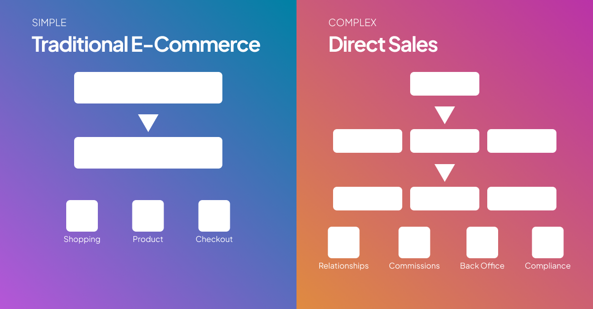
Real-World Case Study: E-commerce Product Pages
Client: Niche e-commerce site selling outdoor gear
Their proposal: “Let’s redesign product pages to look like REI and Patagonia. They’re the industry leaders.”
What they wanted to copy:
- Large hero images with lifestyle photography
- Extensive product descriptions
- Detailed specification tables
- Customer reviews prominently featured
- Multiple product images and videos
Seems reasonable, right? Industry leaders, similar products.
But I asked questions first:
Context Analysis:
REI and Patagonia:
- Brand strength: Massively established, trusted brands
- Product range: Thousands of SKUs, many similar products
- Customer knowledge: Mixed—from beginners to experts
- Purchase behavior: Often browsing, comparing, educating themselves
- Content needs: Need detailed info to differentiate similar products
- Trust level: High brand trust, lower need for social proof
My client:
- Brand strength: Small, growing brand with limited awareness
- Product range: Carefully curated selection, 200 SKUs
- Customer knowledge: Enthusiasts who already know what they want
- Purchase behavior: Coming to buy specific items (high intent)
- Content needs: Already educated, just need to validate this specific product
- Trust level: Lower brand trust, higher need for social proof
What We Learned From User Research:
Interviewed 20 customers:
Question: “Walk me through the last time you bought from us. How did you decide what to purchase?”
Common responses:
- “I already knew what I wanted—saw it recommended on Reddit/YouTube”
- “I just needed to make sure it was authentic and you were a real company”
- “I compared your price to REI and Amazon”
- “I wanted to see real photos from customers, not professional shots”
- “I just wanted to make sure it was in stock and would ship fast”
What This Told Us:
Our users weren’t coming to learn about products. They were coming to:
- Validate authenticity (is this the real product?)
- Compare price
- See social proof (real customer photos and reviews)
- Check availability
- Understand shipping
Completely different from what REI’s users need.
What We Built Instead:
Optimized for high-intent, educated buyers:
-
Trust signals prominent:
- “Authorized dealer” badges
- “Price match guarantee”
- Real customer photos (not lifestyle photography)
- Verified purchase reviews
-
Simplified product info:
- Key specs only (not extensive descriptions)
- Comparison with similar products
- “Why buy from us” vs. competitors
-
Availability and shipping prominent:
- Stock status clearly visible
- Shipping estimate at top of page
- Return policy summary
-
De-emphasized:
- Long product descriptions (users already knew the product)
- Educational content (they’d already researched elsewhere)
- Lifestyle imagery (they wanted validation, not inspiration)
Results:
- Conversion rate: +42%
- Time to purchase: -38% (faster decision-making)
- Cart abandonment: -27%
- Customer feedback: “So much easier than buying from big retailers”
If we’d copied REI’s design, we’d have built for the wrong use case.
When Should You Look at Competitors?
Competitive analysis is valuable when done right:
1. Identify Industry Standards (Then Decide Whether to Follow Them)
Some patterns are so universal that violating them creates confusion.
Example: E-commerce cart icons in top-right corner
Users expect this. Fight it only if you have a very good reason.
But: Just because it’s standard doesn’t mean it’s optimal for your context.
2. Learn What Doesn’t Work
Your competitor’s mistakes are free lessons.
Look for:
- Features they launched then removed
- Patterns they redesigned multiple times
- User complaints in reviews and forums
- Workarounds users created
This tells you what to avoid.
3. Find Gaps They’re Not Serving
Look for:
- User needs competitors ignore
- Segments they don’t serve well
- Use cases they don’t optimize for
Your opportunity is often in doing what competitors don’t.
4. Understand Technical Possibilities
Competitors show you what’s technically feasible.
But: They don’t tell you what’s right for your context.
The Bottom Line
Your competitor’s design is optimized for:
- Their users (not yours)
- Their business model (not yours)
- Their constraints (not yours)
- Their context (not yours)
And they might just be wrong anyway.
The best designs don’t come from copying competitors. They come from:
- Understanding your users deeply
- Defining your unique value proposition
- Optimizing for your specific business goals
- Testing solutions in your context
Look at competitors to understand the landscape. But design for your own users.
After 18 years, here’s what I know: The products that win aren’t the ones that copy their competitors. They’re the ones that solve user problems better by understanding their unique context.
Your competitor’s design isn’t a shortcut to success.
Understanding your users is.