Yoli Omegas Testing Dashboard

Project Overview
A complete dashboard ecosystem built from scratch for Yoli's Omega-3 testing kit program, featuring patient health tracking, distributor patient management, onboarding flows, and a comprehensive Figma design system—created through direct collaboration with development and C-suite stakeholders.
Project Details
- Client
- Yoli
- Project
- Complete Dashboard System for Omega-3 Blood Testing
- Year
- 2025
Objectives & Goals
Design a comprehensive dual-dashboard system that empowers patients to track their Omega-3 levels while enabling healthcare distributors to monitor and support multiple patients toward optimal health outcomes.
The Process
The Challenge
Yoli needed a digital solution for their Omega-3 testing kit program that would serve two very different audiences:
Patients who needed to:
- Understand their current Omega-3 blood test results
- Track progress toward the optimal 8% Omega-3 level
- Engage with their health journey in a motivating way
- Connect with healthcare distributors for guidance
Healthcare Distributors (doctors and nurses) who needed to:
- Monitor multiple patients’ results simultaneously
- Filter and prioritize patients based on their Omega-3 levels
- Follow up with patients who need support
- Manage their patient base efficiently
The system needed to be built from scratch, requiring not just interface design but a complete design system to ensure consistency and scalability.
Design Approach
Understanding Dual User Needs
The first challenge was recognizing that this wasn’t one dashboard—it was two distinct products serving different goals:
Patient Dashboard Focus:
- Clear, encouraging health metrics visualization
- Simple progress tracking toward the 8% goal
- Educational content about Omega-3 benefits
- Easy access to distributor support
Distributor Dashboard Focus:
- High-level overview of patient portfolio
- Powerful filtering to identify patients needing attention
- Efficient workflow for patient follow-up
- Tools to support patient success at scale
Creating the Design System
Working from a blank canvas, I built a comprehensive Figma design system that would support both dashboards:
Foundation Elements:
- Color system optimized for health data visualization
- Typography scale for both data-dense and patient-friendly interfaces
- Spacing and layout grid system
- Component library for consistency across both dashboards
Key Components:
- Health metric cards and visualizations
- Progress indicators and goal tracking
- Data tables with filtering and sorting
- Form elements for onboarding and search
- Alert and notification patterns
This design system ensured that both dashboards felt cohesive while serving their distinct purposes.
Key Features
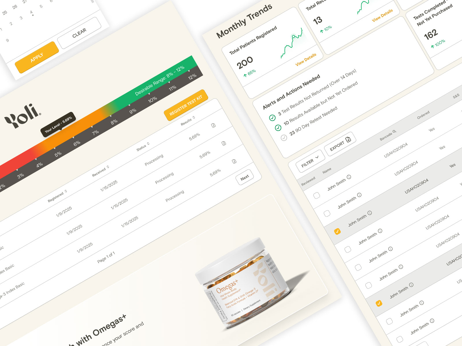
Patient Dashboard
Clear Health Metrics Designed the test results display to be immediately understandable, showing:
- Current Omega-3 percentage with clear visual indicators
- Progress toward the 8% optimal goal
- Historical trend if multiple tests taken
- Educational context about what the numbers mean
Motivational Design Used visual design to encourage positive health outcomes:
- Color-coded results that avoid shame while encouraging improvement
- Progress visualization that celebrates movement toward goals
- Clear next steps and recommendations
- Success states for achieving optimal levels
Distributor Connection Made it easy for patients to access support:
- Distributor search functionality
- Easy way to connect with healthcare professionals
- Contact information and follow-up options
Distributor Dashboard
Patient Portfolio Overview Created a high-level view that lets distributors see:
- Total patients being monitored
- Distribution of patient results (below, near, or above 8% goal)
- Patients requiring immediate follow-up
- Overall portfolio health trends
Advanced Filtering Built powerful filtering capabilities:
- Filter by Omega-3 level ranges
- Identify patients below the 8% threshold
- Sort by test date to find patients due for follow-up
- Search by patient name or ID
Follow-Up Workflow Streamlined the process of supporting patients:
- Quick access to patient contact information
- Ability to mark patients for follow-up
- Notes and communication tracking
- Batch actions for efficient patient management
Onboarding Experience
Designed a smooth onboarding flow that:
- Welcomes new users based on their role (patient or distributor)
- Explains the testing process and dashboard features
- Guides patients through distributor search and selection
- Sets up accounts with necessary information
- Creates positive first impression of the platform
Distributor Search
Built an intuitive search experience:
- Location-based distributor discovery
- Filtering by specialty or credentials
- Distributor profiles with contact information
- Easy connection process
Collaboration Process
Working with Development
As the sole designer working directly with the lead developer, I:
- Created detailed component specs for implementation
- Documented interaction states and behaviors
- Maintained ongoing communication to address technical questions
- Iterated based on development constraints and opportunities
- Ensured design feasibility throughout the process
C-Suite Stakeholder Management
Working with executive leadership required:
- Clear presentation of design rationale and user research
- Balancing business goals with user needs
- Iterating based on strategic feedback
- Managing expectations around scope and timeline
- Demonstrating how design decisions support company objectives
Design Decisions
Visualizing Health Data
One of the core challenges was making Omega-3 percentages meaningful and motivating:
The 8% Goal Line
- Made this threshold prominent in all visualizations
- Used it as a reference point for patient progress
- Avoided judgmental language for those below the goal
- Celebrated achievement when patients reached optimal levels
Color Strategy
- Carefully chosen colors that indicated status without causing alarm
- Avoided red/green patterns for accessibility
- Used progressive color scales to show improvement
- Maintained consistency with Yoli’s brand
Balancing Two Dashboards
Designing for two user types meant:
- Shared design language for brand consistency
- Different information architectures for different goals
- Appropriate complexity levels for each audience
- Reusable components adapted for context
Technical Specifications
Figma Design System
Delivered comprehensive design files including:
- Complete component library with variants
- Responsive layouts for desktop and tablet
- All interaction states documented
- Style guide with implementation specs
- Prototypes demonstrating key flows
Responsive Design
Designed primarily for desktop use (where healthcare professionals work) with tablet considerations:
- Optimized layouts for typical screen sizes
- Ensured data tables remained readable
- Maintained chart and graph clarity at different sizes
Outcomes
Dual-Dashboard Success
Successfully created a system that serves both user types:
- Patients have clear, motivating access to their health data
- Distributors can efficiently manage and support patient populations
- Both experiences feel cohesive while meeting distinct needs
Scalable Design System
The Figma design system provides:
- Consistent visual language across the product
- Reusable components that speed development
- Documentation for future feature additions
- Foundation for product growth
Streamlined User Flows
The onboarding and distributor search features:
- Reduce friction in getting started
- Connect patients with appropriate healthcare support
- Set up users for success from day one
Key Learnings
Designing for Dual Audiences
Creating a product that serves two user types taught me:
1. Different Doesn’t Mean Disconnected While the dashboards serve different needs, they exist in the same ecosystem. Design decisions must work for the overall product, not just individual parts.
2. Design Systems as Bridges A strong design system helps maintain consistency while allowing flexibility for different use cases. The same components can be adapted for different contexts.
3. Prioritization Is Critical With limited time and resources, focusing on core features for each user type was more valuable than trying to build everything at once.
Health Data Visualization
Designing health-related interfaces requires:
Clarity Without Oversimplification Health data is complex, but users need to understand it quickly. Finding the balance between accuracy and accessibility is crucial.
Motivation Over Judgment Numbers below optimal levels shouldn’t feel like failure. Design can encourage improvement without causing anxiety or shame.
Context Matters Raw numbers mean little without context. Providing reference points (like the 8% goal) and trends helps users understand their results.
Stakeholder Collaboration
Working directly with C-suite and development:
Clear Communication Wins Presenting design decisions with clear rationale helps stakeholders understand the “why” behind choices.
Constraints Drive Creativity Working within development and business constraints often leads to more focused, practical solutions.
Iteration Is Normal Feedback from stakeholders and technical considerations naturally lead to iteration. Embracing this as part of the process leads to better outcomes.
Conclusion
The Yoli Omegas Dashboard project demonstrates the power of thoughtful dual-audience design backed by a comprehensive design system. By understanding the distinct needs of patients and healthcare distributors, I created an ecosystem that:
- Empowers patients with clear health insights and motivating progress tracking
- Enables distributors to support more patients more effectively
- Maintains consistency through a scalable design system
- Supports growth with a foundation ready for future features
Working from scratch to build both the product design and design system—while collaborating directly with development and executive leadership—resulted in a complete, production-ready solution that serves Yoli’s mission of helping people achieve optimal Omega-3 health.
Most importantly, the design puts health data in context, makes progress visible, and connects patients with the support they need to reach their wellness goals.
Results & Impact
Successfully delivered a production-ready design system that supports two distinct user types with different needs, streamlines patient onboarding and distributor search, and provides clear visualization of health metrics to drive patient engagement and distributor effectiveness.