PetSmart: Homepage & Navigation Redesign
A sitewide navigation and homepage redesign for a 1M-page e-commerce catalog, reordering the shopping experience around the pet instead of the product category.
The Numbers
10%
increase in navigation menu usage
20%
increase in purchases of PetSmart's in-house brands
1M+
pages restructured under a new navigation system
2 years
on the site's highest-traffic pages
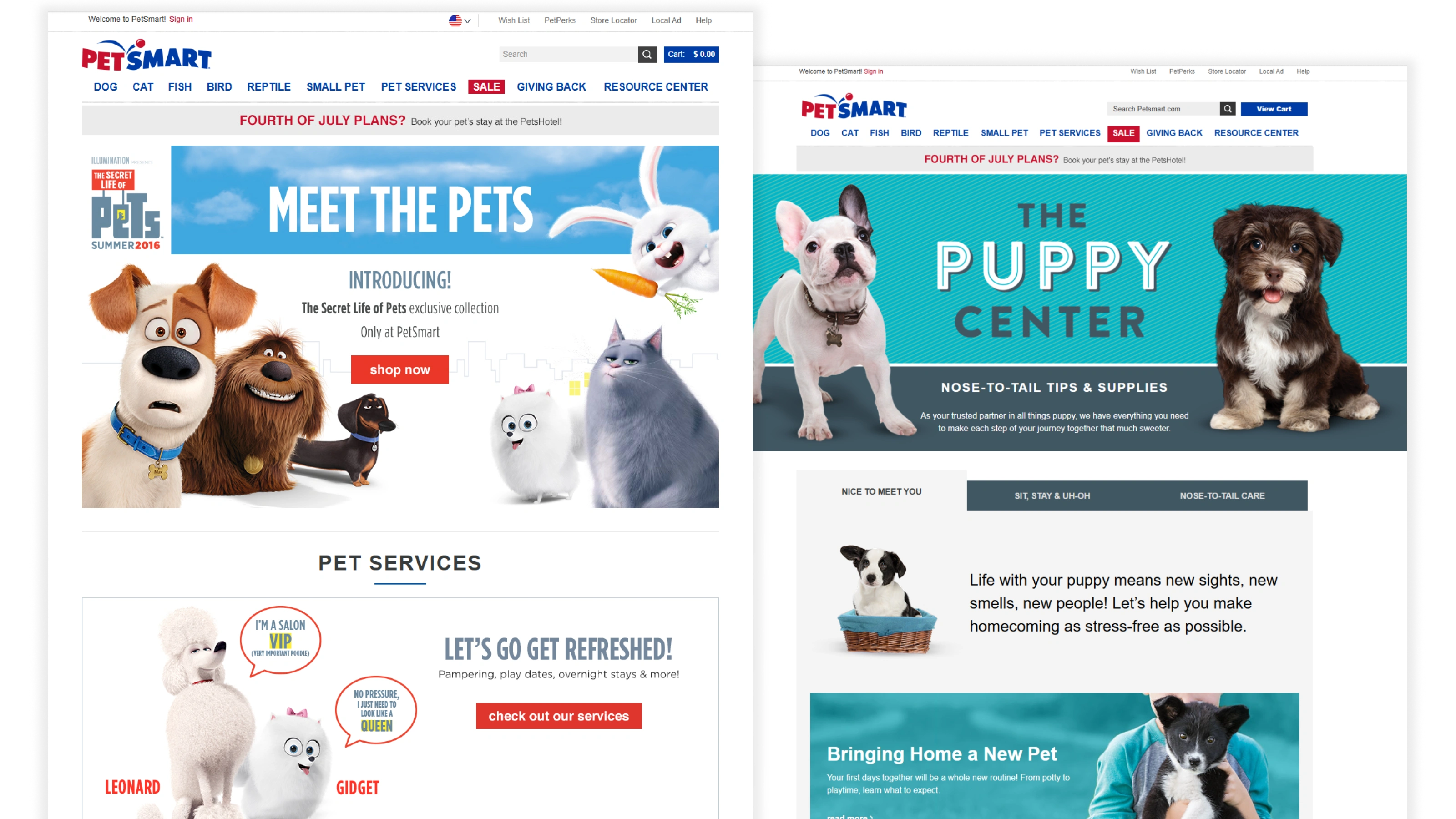
The Problem
petsmart.com was over 1M pages, and none of it was organized the way anyone actually shops. The navigation was built around product category first, so someone looking for dog food landed in a general pet food listing and had to scroll past cat food, bird seed, fish flakes, and reptile pellets to reach the thing they came for. Nobody thinks about their pet that way, you don’t walk in with a food problem, you walk in with a dog.
So people stopped using the navigation and went straight to search instead, a workaround that sounds fine until you look at what search was being asked to carry. It wasn’t built to sort 1M pages worth of intent, and it didn’t help someone who was browsing rather than hunting for one specific product. The menu was right there. It just wasn’t answering the question people were actually asking.
Role and Constraints
I was the senior web designer on the redesign, owning the homepage and leading the restructure of the sitewide navigation, plus the design decisions on product listing and detail pages underneath it.
The constraint was scale. At 1M pages, changing the navigation isn’t a navigation project, it’s a resorting of the entire catalog, and every decision ripples out across thousands of pages and a lot of people who care deeply about where their category lands. That meant nothing could be argued on instinct. If dog was going to sit at the top of the menu, the reason had to be traffic data, not an opinion about dogs.
What I Built
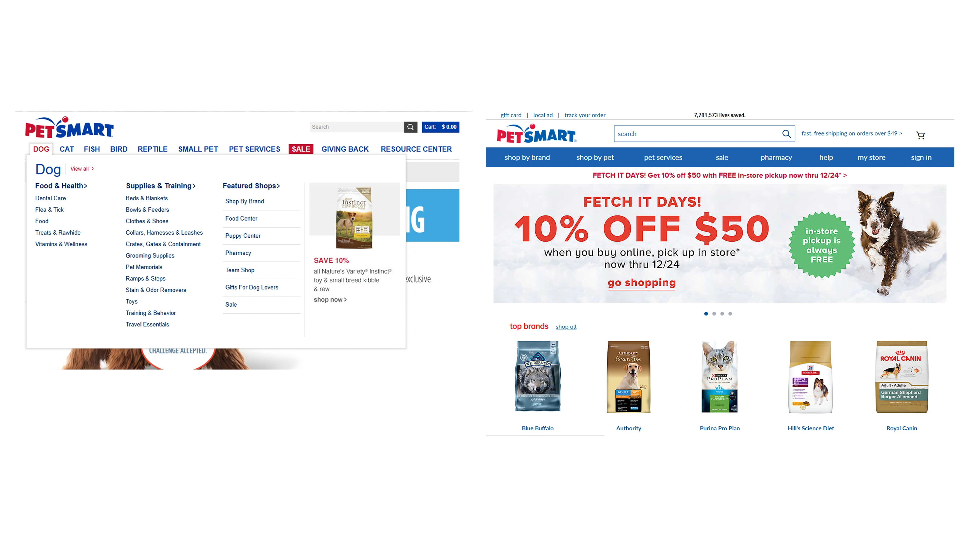
I restructured the navigation around animal first, then category. Dog led, because it was the highest-traffic category on the site, with food as the first subcategory beneath it, and everything below that ordered by real customer demand rather than by how the catalog happened to be filed internally. It’s a small-sounding change that rewrote the first decision every visitor makes.
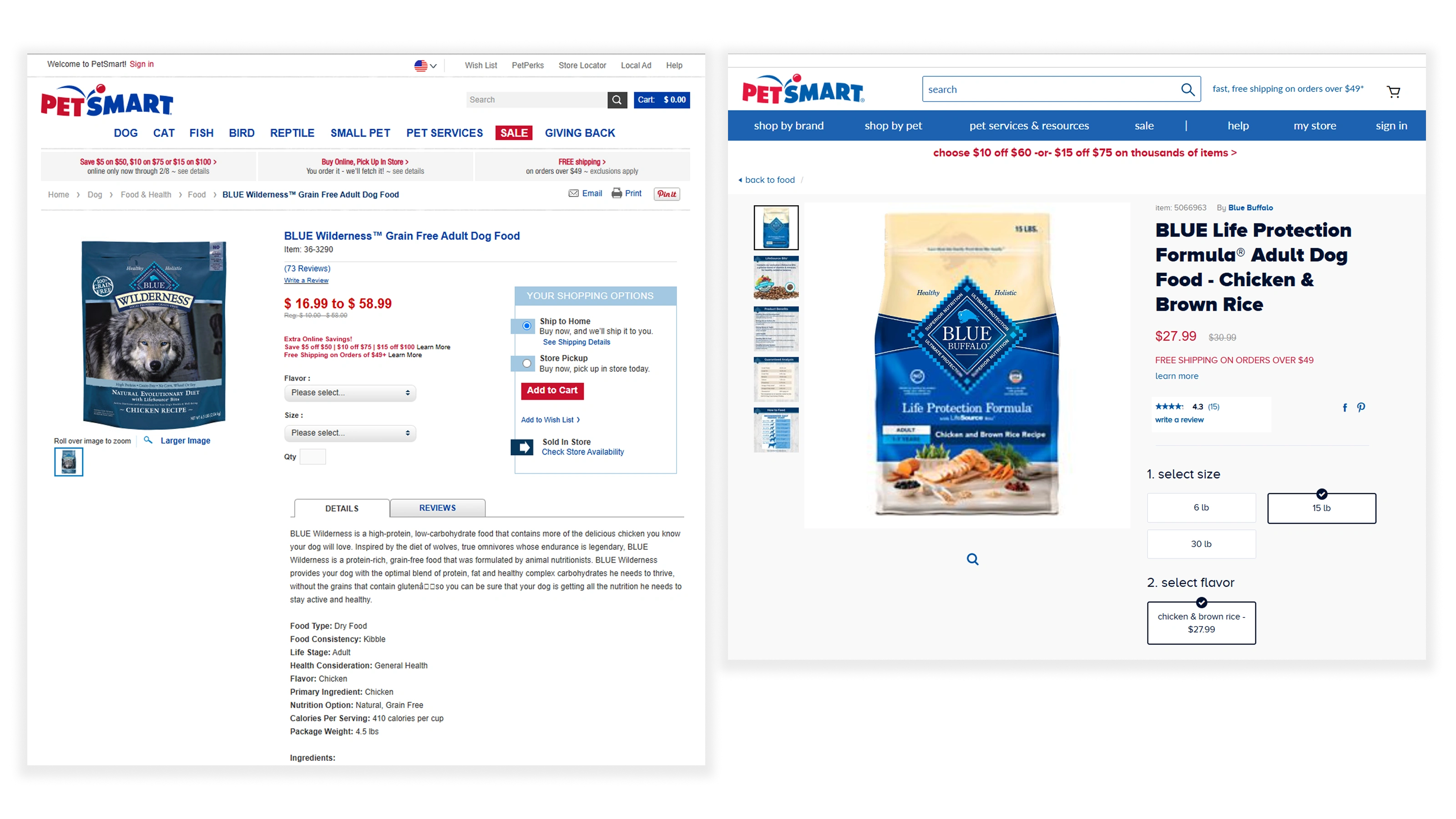
For the listing and detail pages, I ran A/B tests and dug into competitive research against Walmart and Petco. Walmart led with price, and price drove their whole layout. PetSmart customers weren’t shopping the same way, they cared more about seeing variation and options clearly: what sizes, what formulas, what’s actually different between two bags. That finding reshaped the detail page, pulling product variation forward instead of leading with a number.
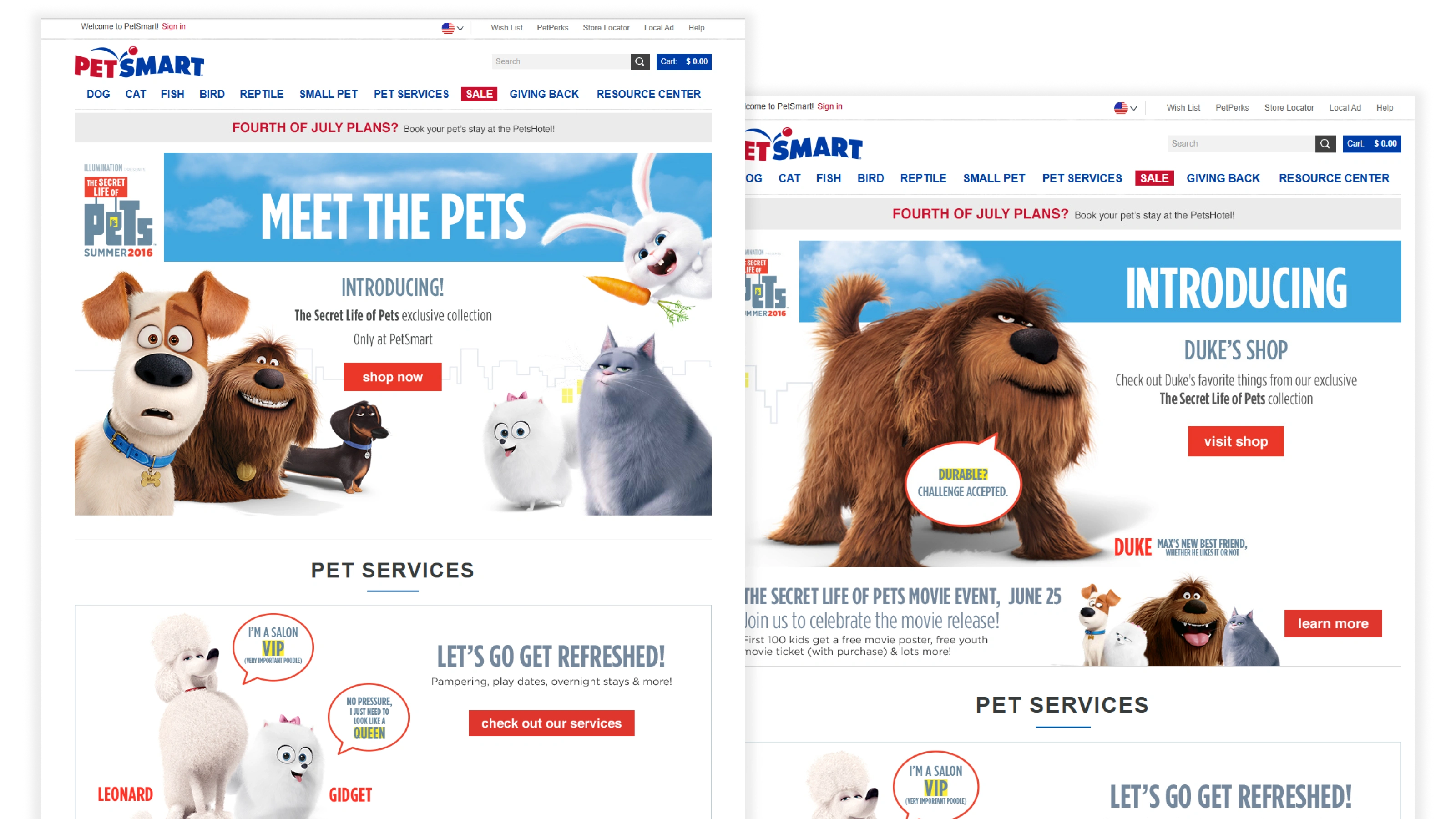
I also owned the homepage itself and coordinated the digital campaign design for PetSmart’s collaboration with Universal Studios on The Secret Life of Pets, including a new-puppy-owner campaign that paired care articles and training guidance with a coupon package, so someone who just brought home a puppy got something genuinely useful alongside the offer.
Results
The navigation redesign drove a 10% increase in menu usage, people using the navigation instead of routing around it. It also increased visibility for PetSmart’s in-house brands, which saw a 20% increase in purchases after the change. Putting products where people were already looking turned out to matter more than any individual promotion of them.
What I'd Push Further
I’d have treated search and navigation as one system instead of two, customers had already voted for search by using it, and we improved the menu without ever fully closing the loop between them. I’d also push harder on remembering the pet, if someone tells you through their first three clicks that they have a dog, the site shouldn’t make them say it again on every visit.
The other thing I learned, the hard way: at that scale, the design work is the smaller half of the job. The bigger half is alignment. Every category has someone advocating for it, and getting to a navigation ordered by actual customer demand meant showing the data over and over until the ordering stopped being a matter of preference, a skill I’ve used on every large project since.