Green Compass: Enrollment Flow, Built from Nothing
A from-scratch distributor enrollment flow for a CBD wellness company, designed to launch in 90 days and cut customer service calls by 25%.
The Numbers
25%
reduction in customer service calls
12%
decrease in cart abandonment
15%
increase in distributor enrollments
90 days
from design to launch
The Problem
Green Compass had a basic e-commerce site and a lot of hand-holding. There was no enrollment flow. Every new distributor sign-up depended on an existing distributor being physically present to walk them through it, explain the discounts, and make sure they hit the minimum order required to qualify. The site itself showed none of this. No indication of bundle pricing, seasonal deals, or subscription discounts. If your distributor didn’t know something or told you wrong, you found out the hard way.
That put pressure on three different groups. New customers were stuck relying entirely on whatever their distributor happened to know or remember to tell them. Distributors were expected to be constantly up to date on changing products, pricing, and seasonal offers, with no system helping them do it. And customer service absorbed the fallout, angry calls from people who didn’t understand their subscription pricing, or missed a discount because nobody told them it existed.
Role and Constraints
I started as a freelancer and was later hired on full-time as Director of Digital Experience once the work proved out. I owned the process end to end, planning, wireframing, and managing it through release, directing a small design team of two while staying hands-on myself. I worked closely with IT on implementation and with legal on compliance.
Two real constraints shaped the design. Some products legally couldn’t be combined with certain discounts, and the interface had to explain that clearly to someone mid-selection, not after the fact. And new distributor accounts required a social security number at checkout. Asking for that first would have killed the flow before it started, so it moved to the very last step, after someone had already invested time building their kit and had a reason to finish.
What I Built
There was nothing to redesign. I designed the enrollment flow from scratch.
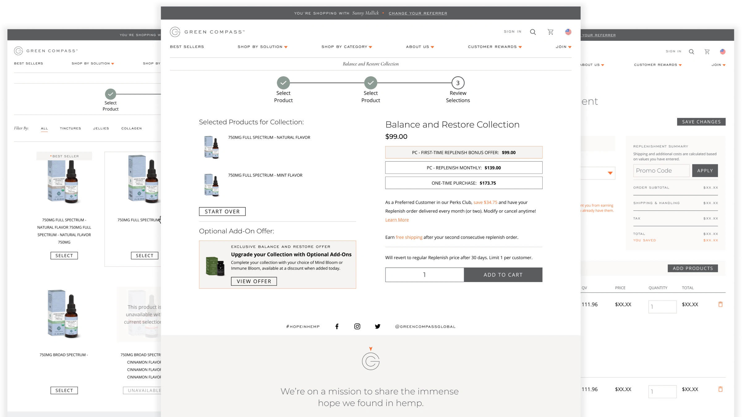
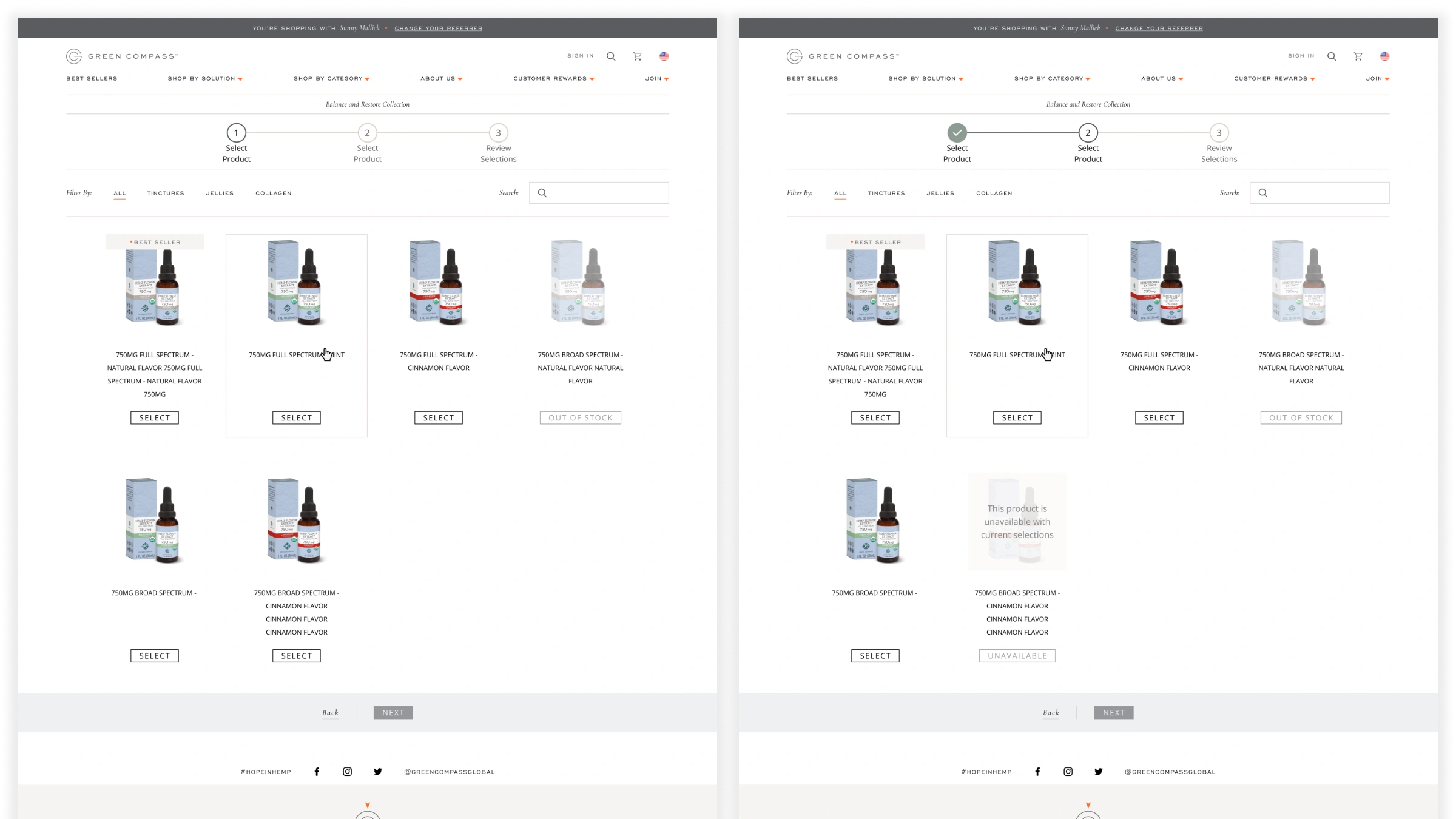
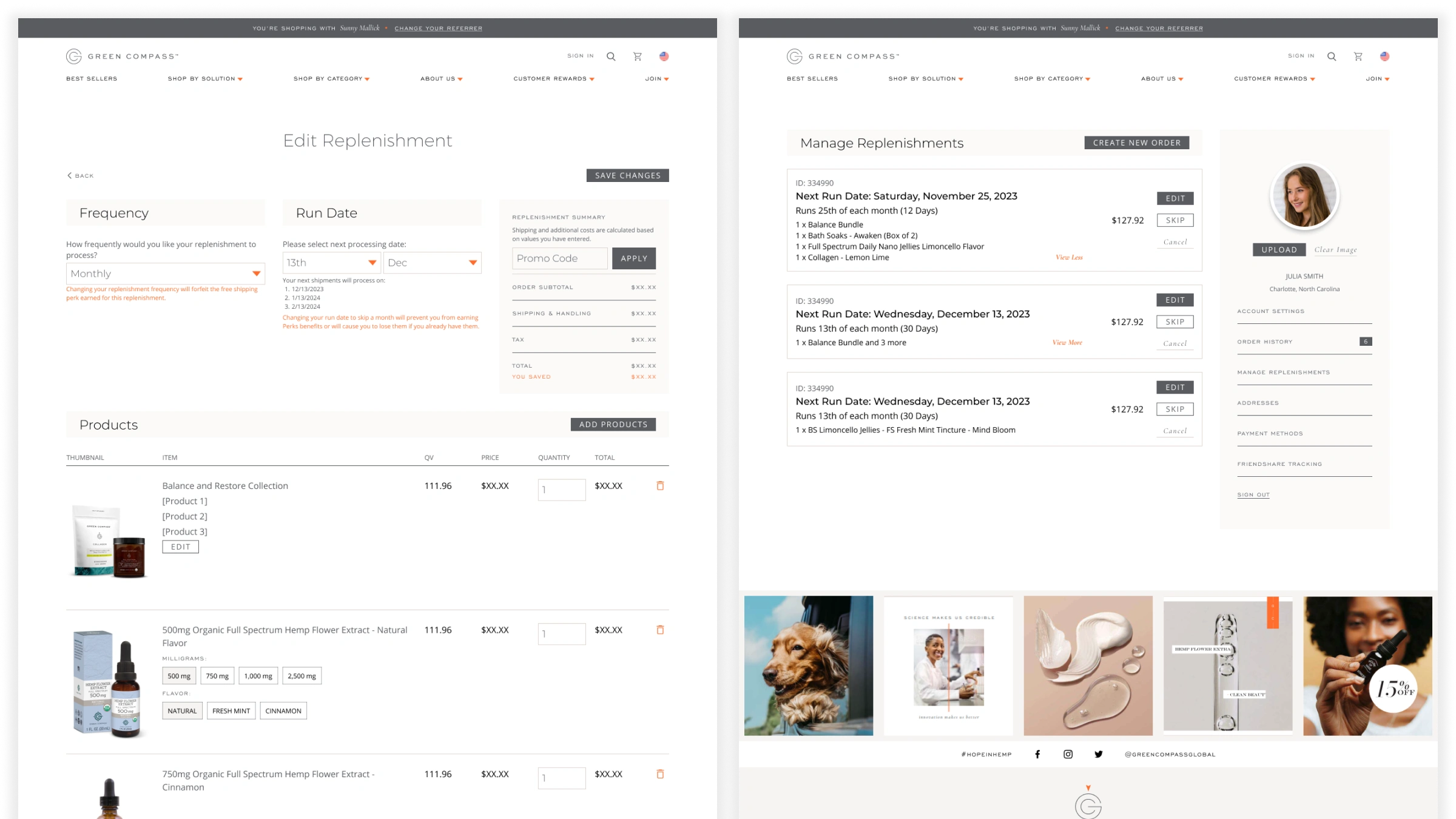
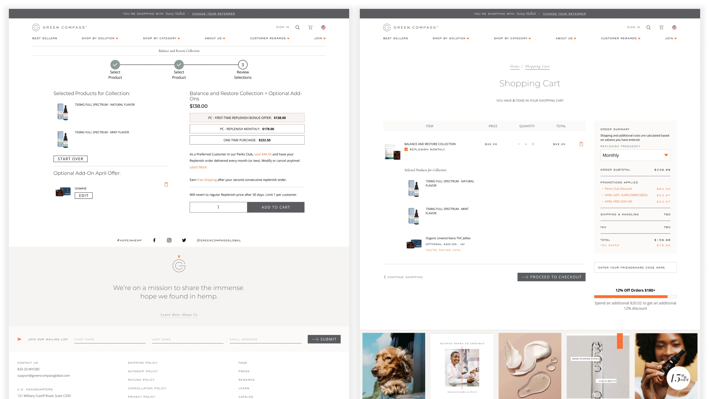
A new distributor starts by choosing a prebuilt kit or customizing their own. Customizing walks them through a clear three-step process: pick a first product, pick a second, review and check out. If a second product can’t legally pair with the first, it shows as disabled with an explanation instead of just disappearing. After the second selection, there’s a one-time upgrade offer, take it or skip it. The review step lays out real pricing for all three ways someone could buy, one-time retail, ongoing subscription, or distributor enrollment, so nobody’s guessing what they’re actually signing up for.
The hardest part of the whole flow was pricing itself. Retail was simple. Subscription pricing had a few discounts layered in, still manageable. Distributor enrollment pricing was where it got complicated: first-time discounts, one-time seasonal offers, some of which converted into ongoing subscriptions and some of which didn’t, and the need to show what someone would pay going forward, not just today. Getting that legible without overwhelming someone became the core design problem.
We tested with a panel of real distributors during design. The first version used a two-step checkbox flow. Distributors pushed back, hard, saying their customers needed to be walked through it more slowly and clearly, especially the ones who weren’t tech comfortable. That’s why it became three steps instead of two, and why the language changed to match how distributors actually talk to their customers rather than how a product team would write it. They were excited about it. Nothing like it existed for them before.
Results
Over the course of the engagement, the redesigned flow drove a 25% reduction in customer service calls, a 12% decrease in cart abandonment, and a 15% increase in distributor enrollments. It went from concept to launch in 90 days.
What I'd Push Further
Looking back, I’d have pushed harder to separate retail and subscription checkout from the distributor enrollment path entirely, rather than having all three live in the same flow. Distributor enrollment is where the real complexity and the real business value both lived. A dedicated, uncluttered experience for it alone would have moved the needle even more.
I’d also lean further into the prebuilt kits. Custom kit building is powerful, but people who build something themselves want it to feel like theirs. Something as simple as a shareable, personalized landing page for the kit they built, tied to their own referral link, would have turned the enrollment moment into a small piece of marketing on its own.
The other thing I learned, the hard way: Exigo, the platform this was built on, came with real technical limitations that shaped what was actually possible. Working around a legacy platform while still trying to design something that felt modern was its own skill, one I didn’t fully appreciate until I was deep in it.