iFoodDS: Agriculture Compliance App Rebuild
A tablet-first rebuild of a food-safety compliance app used across the agriculture supply chain, restructuring 3k+ forms into role-based navigation and nearly doubling adoption.
The Numbers
3k+
forms covering every step of the supply chain
30%
of users actually on the app when I started
70%
increase in adoption after the rebuild
~60%
less time spent finding forms and documents
The Problem
iFoodDS tracked food from the farm to the table. Every step of that journey generates a record, a scientist testing a water supply, a field worker logging chemical usage or weather conditions, a processing facility documenting how produce got washed, sorted, and quality checked, a warehouse tracking equipment. All of it feeds trend analysis, contamination tracing, and compliance reporting for national retailers and foodservice distributors buying at the other end of the chain.
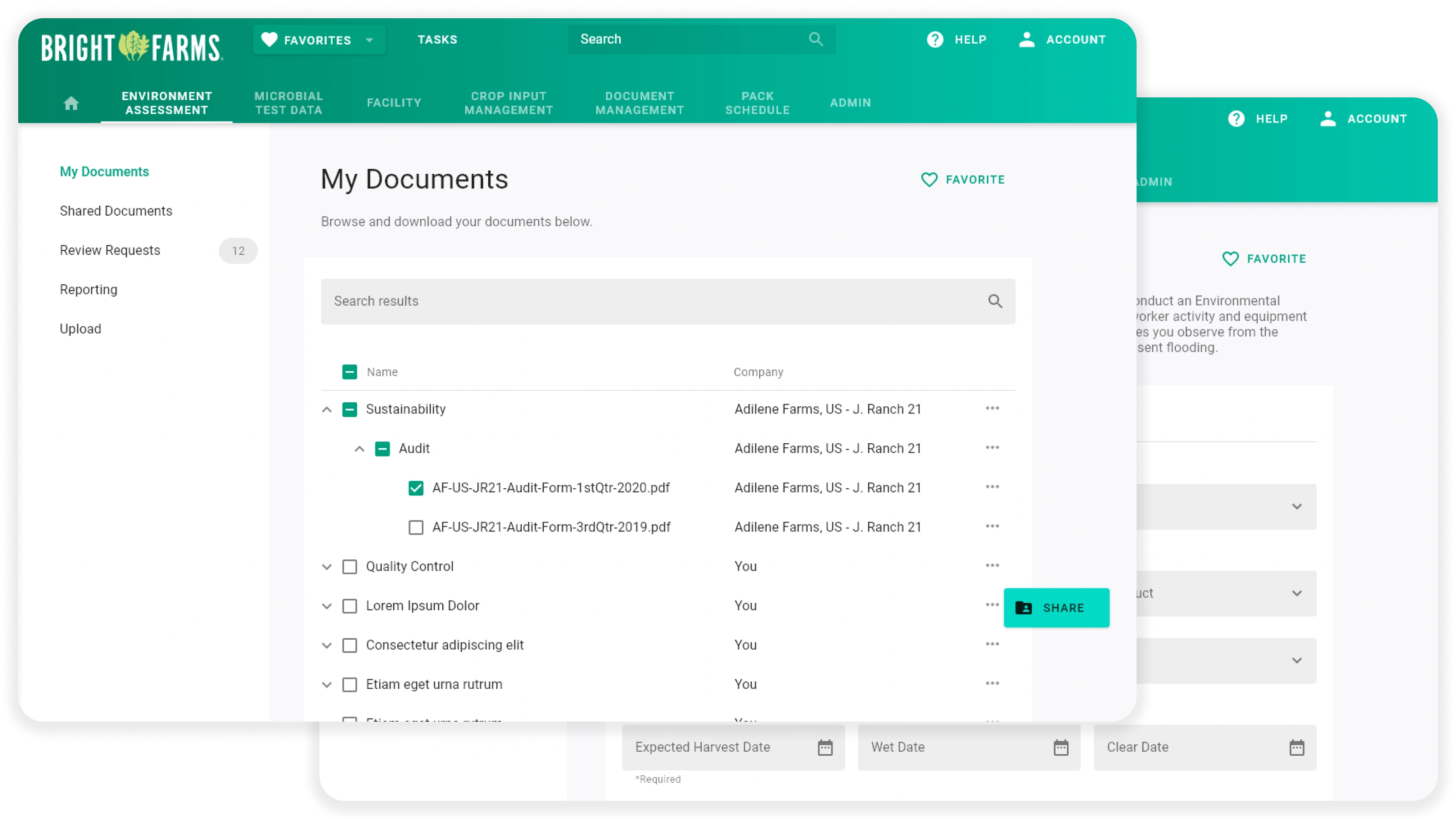
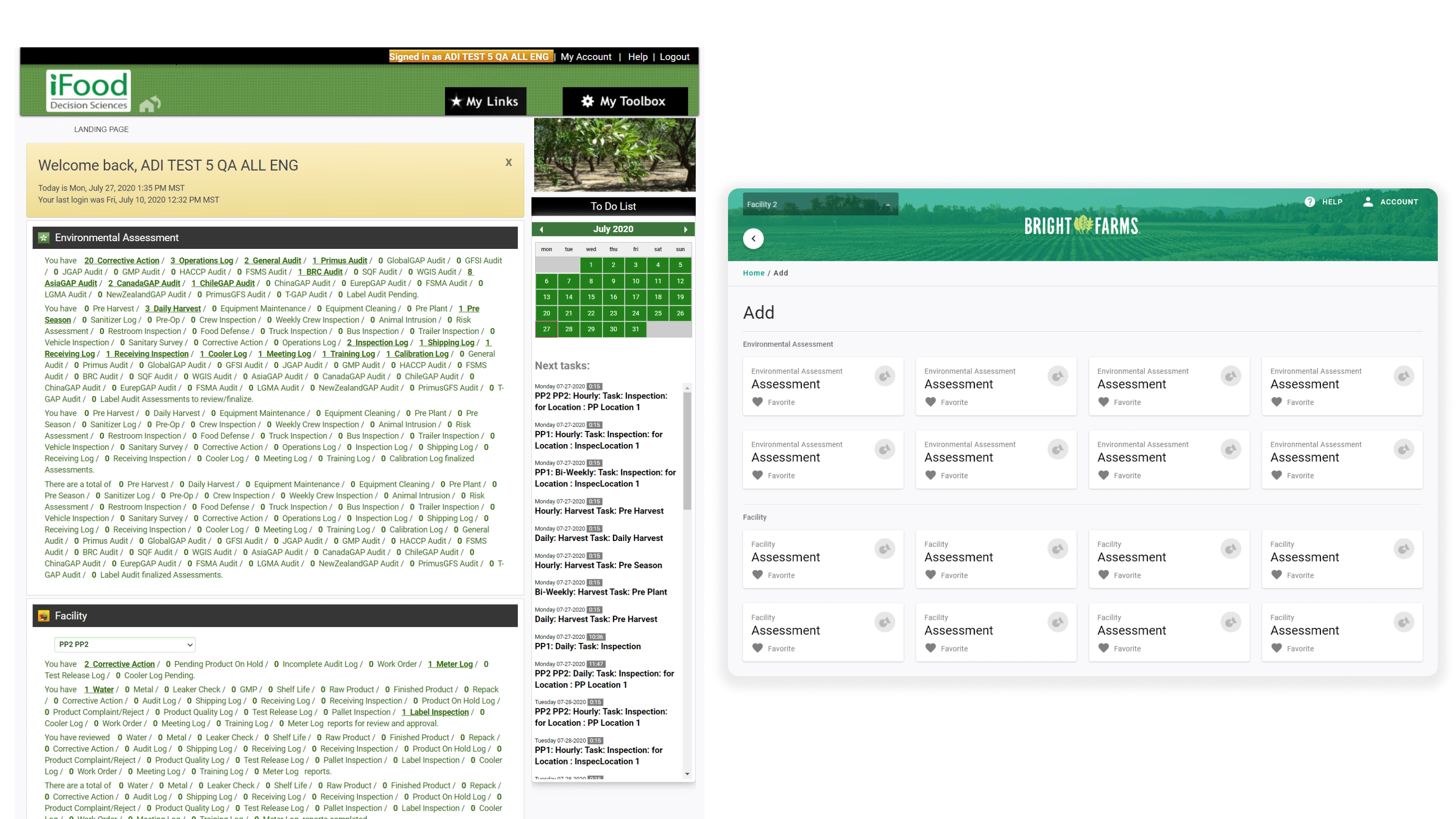
The app to digitize that already existed. Almost nobody was using it. About 70% of users were still on paper, and the 30% who had adopted it were mostly managers and directors, not the people actually doing the work, a backwards adoption curve for a system that depends entirely on the people generating the data. The app had a form for every part of the process, 3k of them, dumped into a wall of link text with no grouping and no hierarchy, built as a desktop app and then put on tablets, with an admin panel rough enough that the people meant to simplify it for everyone else couldn’t get through it themselves.
Role and Constraints
I was brought on as a UX/UI designer, reporting to the CTO and working day to day with the app developers, with the CEO close enough to the work to be part of the conversation. The first 90 days were research: pulling quantitative usage data, running qualitative customer surveys, and presenting the whole picture to the entire iFoodDS team. Everyone knew adoption was bad. What they didn’t have was a shared, specific account of who was dropping off and why.
The constraints were real. This is a compliance system, so the digital record has to hold up to the same scrutiny the paper did, nothing could be simplified out of existence just because it was in the way. Users were on tablets, often in the field, often with their hands full. And the people I most needed to reach had years of muscle memory in a process that already worked fine for them, so any friction in the app was a reason to go back to paper.
What I Built
The core idea was that nobody should see the whole system. They should see their job. If a user only had one form to fill out, they logged in and landed on that form, no dashboard, no navigation, no browsing. Power users and admins got the opposite: full navigation and a real directory to work through.
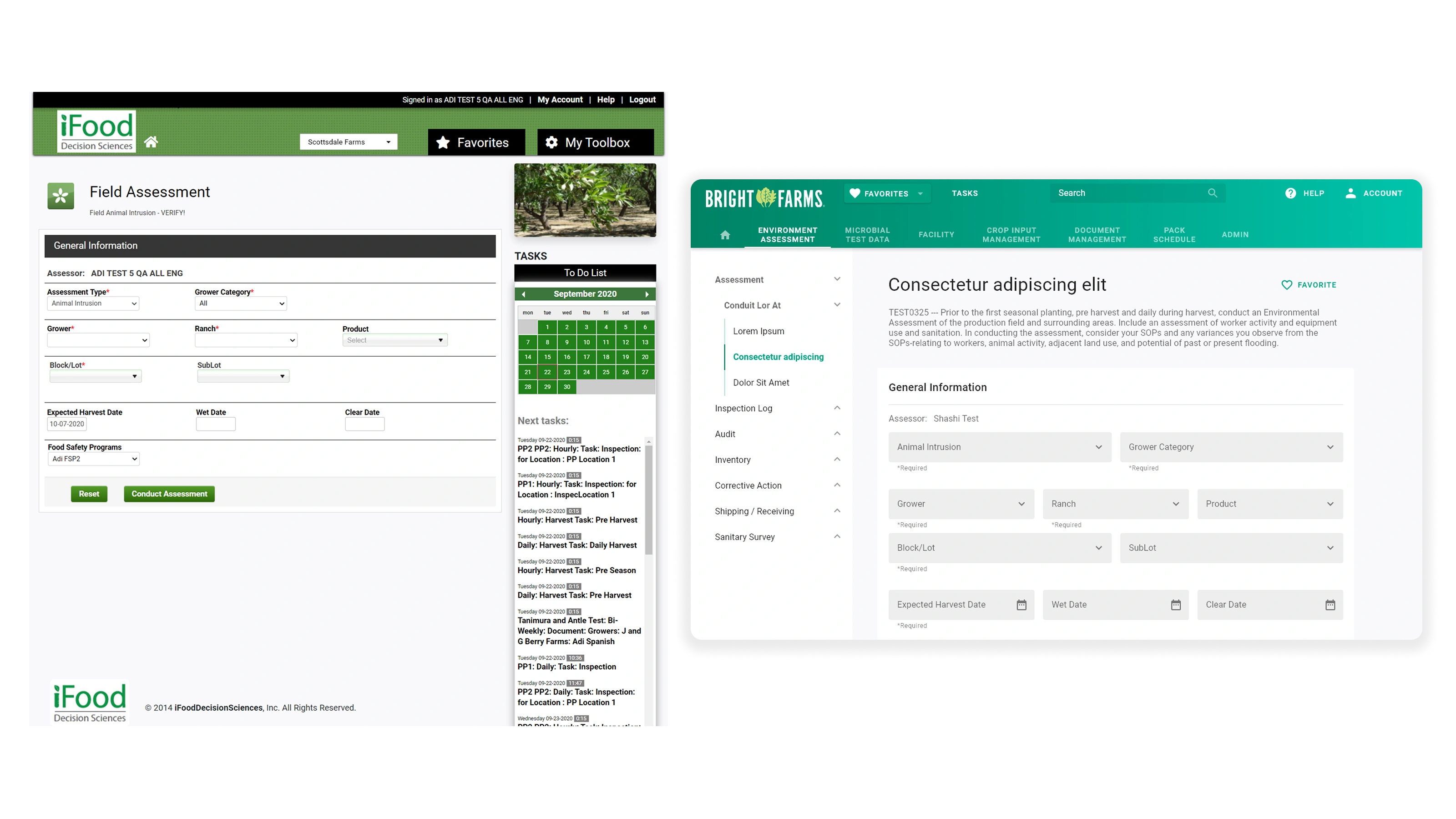
That directory was the other half of the fix. I restructured how forms and documents were organized on the back end and built an actual directory tree, with categories, sections, and visual separators, instead of one undifferentiated list, and reworked search alongside it so finding a specific form stopped being a scroll-and-scan exercise.
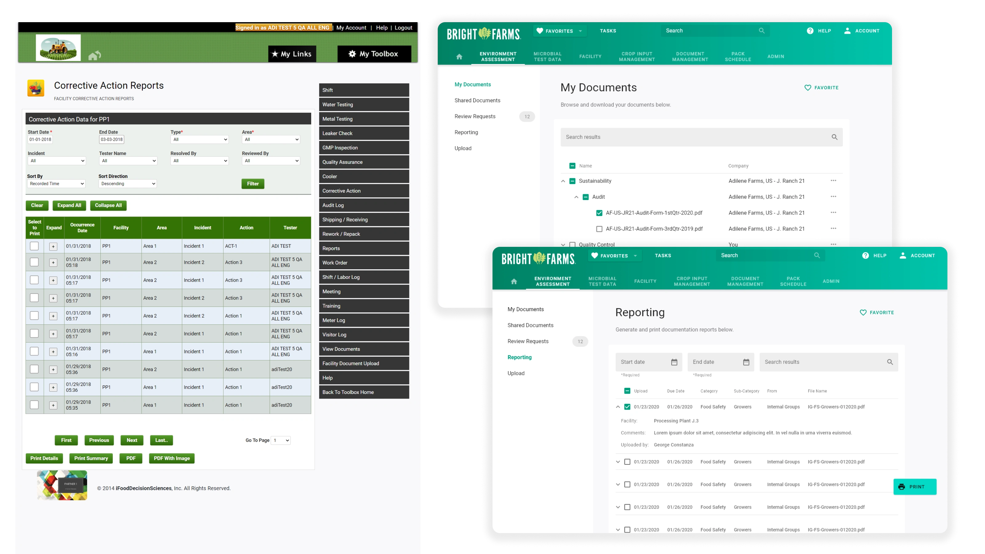
I rebuilt the interface for landscape tablet, how people actually held the device, rather than carrying over a desktop layout, and stripped out clutter page by page, including decorative produce photos that were taking up space and telling nobody anything. The last piece was white labeling: a theming system that let each company carry its own colors through the app, so it read as their tool rather than a vendor’s.
Results
Adoption went up about 70% from that 30% starting point, close to double the number of people actually using the app. The time admins spent hunting through it for forms and documents dropped by about 60%, since most of what they needed was now visible instead of buried. The app hadn’t been failing because people were resistant to going digital, it was failing because it was confusing, and confused people go back to what they know.
What I'd Do Differently
I’d have spent real time in the field. All of my research was quantitative data and customer surveys, which told me where people dropped off and roughly what they said about it, but never put me next to someone standing in a processing facility filling out a form on a tablet with gloves on. I fixed what the data could show me. I’ve always suspected there was another layer underneath it that only fieldwork would have reached.