iFoodDS Agriculture Platform Transformation
Project Overview
As UI/UX Designer, redesigned iFoodDS's agriculture compliance platform serving thousands of users across food processing facilities. Created a universal smart submission form with user-generated folder structure, solving critical scalability issues while designing an intuitive interface that helped resistant farmers adopt digital workflows. The platform tracks farm-to-table data and identifies contaminants for major distributors like Walmart and Sysco.
Project Details
- Client
- iFoodDS
- Project
- Modernizing Farm-to-Table Data Collection SaaS
- Year
- 2020
Objectives & Goals
Transform a complex, non-scalable agriculture data collection platform into an intuitive, infinitely scalable iPad application that helps farmers, scientists, and maintenance workers transition from paper-based processes to digital submission while maintaining food safety compliance for major distributors.
The Process
The Challenge
iFoodDS was a critical link in the food safety chain—a SaaS platform that collected compliance data from food processing and agriculture facilities for major distributors like Walmart and Sysco. The platform tracked everything from farm to table, monitoring each step of the process to identify bacteria and contaminants like Listeria.
But the application had serious problems:
Critical Pain Points
Scalability Crisis The platform couldn’t scale to thousands of forms—most of which were rarely used daily. The existing architecture created overwhelming complexity for users who only needed access to a small subset of forms.
Paper-Based Resistance Farmers and facility workers were deeply resistant to switching from paper to iPads. Paper was familiar, reliable, and didn’t require charging or Wi-Fi. Digital adoption was failing.
Complex User Base
- Farmers: Traditional, paper-oriented, varying tech literacy
- Scientists: Data-focused, needed detailed tracking and analysis
- Maintenance Workers: On-the-go, needed quick data entry on tablets
- Facility Managers: Oversight responsibilities, compliance reporting
Tablet-First Usage The main application usage was on tablets in agricultural environments—not ideal conditions for complex software. Devices got dirty, users wore gloves, connectivity was unreliable.
Unclear Workflows Existing workflows were confusing and inefficient. Users struggled to complete tasks, leading to high support ticket volumes and low user satisfaction.
My Role & Approach
As UI/UX Designer, I was brought in to solve these fundamental problems. This wasn’t just a visual refresh—it was rethinking how agricultural data collection could work at scale while respecting user resistance to change.
Dual Responsibility
UX Designer
- Conducted user research with farmers, scientists, and facility workers
- Analyzed behavioral analytics to understand actual usage patterns
- Redesigned core application workflows
- Developed interactive prototypes for validation
Front-End Architect
- Implemented responsive design patterns across device types
- Utilized modern JavaScript frameworks for better performance
- Collaborated with backend developers on API optimization
- Created comprehensive design system for iPad application
User Research & Discovery
Understanding the Resistance
I started by understanding why farmers hated the app:
Findings from Field Research:
- Paper is Predictable: Never crashes, always works, familiar process
- iPads are Fragile: Fear of breaking expensive equipment in agricultural environments
- Complexity Overwhelms: Too many options, unclear navigation, buried features
- Time is Money: Slow task completion meant lost productivity
- Trust Issues: Digital felt less official than signed paper forms
Behavioral Analytics Revealed:
- Users only accessed 5-10% of available forms regularly
- Most time was spent searching for the right form, not filling it out
- High abandonment rates on multi-step processes
- Mobile performance issues causing frustration
The Core Insight: The problem wasn’t that farmers hated technology. They hated complex, slow, unreliable technology. Make it simpler than paper, and they’d adopt it.
The Solution: Universal Smart Submission Form
Infinite Scalability Through Simplicity
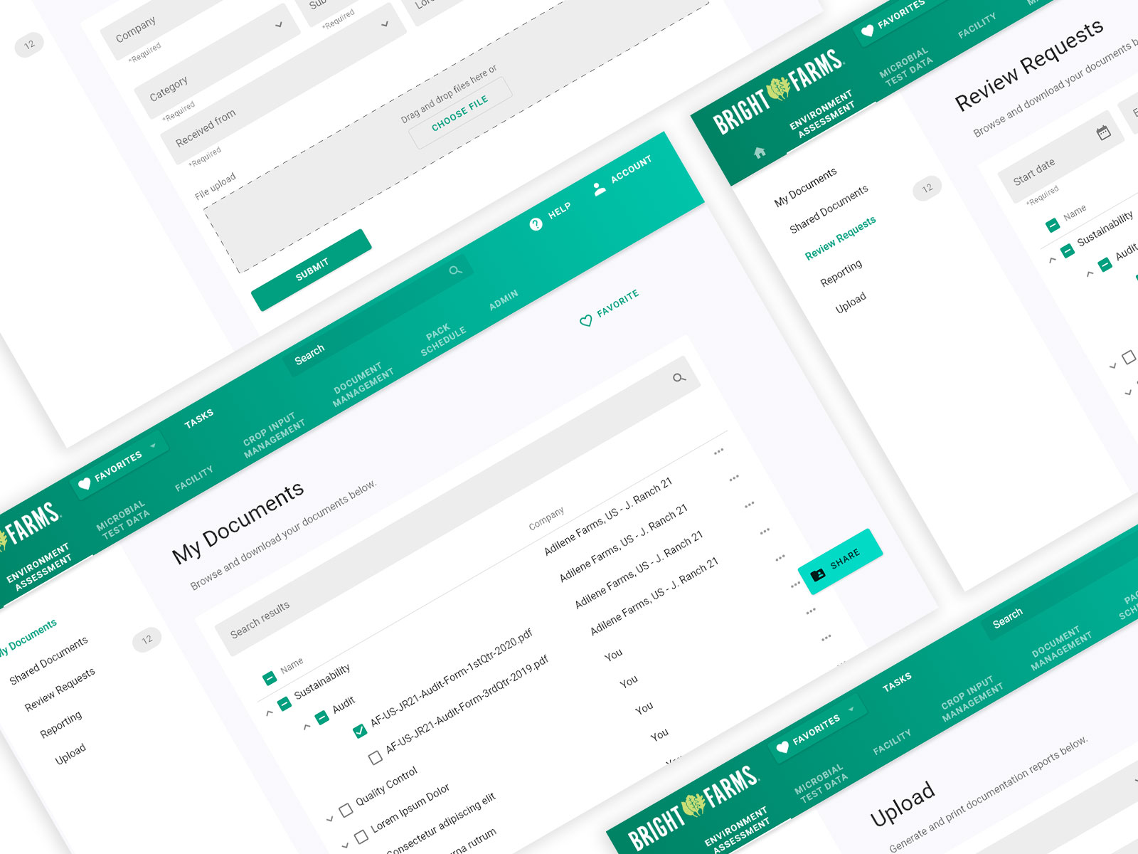
Instead of presenting thousands of individual forms, I designed a universal smart submission form with a user-generated folder structure system.
How It Worked:
1. Folder-Based Organization
- Users created custom folders matching their workflow (e.g., “Daily Inspections,” “Monthly Reports,” “Equipment Maintenance”)
- Forms nested within folders based on user needs, not system logic
- Personal organization meant no two users had identical structures
- Reduced cognitive load by showing only relevant forms in context
2. Universal Form Template
- Single, infinitely adaptable form interface
- Smart fields appeared based on form type
- Consistent interaction patterns across all submission types
- Users learned one interface, not thousands
3. Smart Defaults & Autofill
- System learned user patterns and pre-populated common values
- Location-based defaults (facility name, area, etc.)
- Previous submission data suggested when relevant
- Reduced data entry by 40-60% for repeat tasks
4. Progressive Disclosure
- Only essential fields shown initially
- Advanced options revealed when needed
- Clear visual hierarchy guided users through complex forms
- No overwhelming “wall of fields”
Making It Work on Tablets
Designed specifically for agricultural tablet use:
Touch-Optimized Interface
- Large tap targets (minimum 44x44px)
- Generous spacing between interactive elements
- Glove-friendly controls
- No hover states or complex gestures
Offline-First Architecture
- Forms worked without internet connection
- Data synced when connectivity returned
- Clear visual indicators of sync status
- No data loss from dropped connections
Durability Considerations
- High contrast for outdoor readability
- Simple, clear visuals (no tiny text or icons)
- Minimal scrolling on tablet screens
- Error prevention over error recovery
Redesigning Core Workflows
Before & After
Old Workflow: Finding a Form
- Navigate complex menu system (3-4 levels deep)
- Search through hundreds of alphabetically sorted forms
- Often pick wrong form, start over
- Average time: 2-3 minutes
New Workflow: Finding a Form
- Open personal folder structure
- Select form (1 tap)
- Average time: 5-10 seconds
Old Workflow: Completing Inspection
- Fill 30+ fields on scrolling form
- Navigate between multiple pages
- Submit (often fails due to validation errors)
- Average time: 8-12 minutes
New Workflow: Completing Inspection
- Smart form pre-fills known data
- Only 5-8 unique fields to complete
- Real-time validation prevents errors
- Average time: 2-4 minutes
Impact:
- Task completion time reduced by 60-70%
- Support tickets decreased significantly
- User satisfaction improved dramatically
Design System for iPad
White-Listed Application Standards
Created comprehensive design system for the white-listed iPad application:
Foundation
- Color palette optimized for outdoor visibility
- Typography scale readable at arm’s length
- Spacing system based on touch target sizes
- Iconography clear at small sizes
Components
- Form inputs (text, number, date, selection)
- Data tables optimized for tablet viewing
- Navigation patterns (tabs, folders, breadcrumbs)
- Status indicators (sync, validation, completion)
- Error states and messaging
- Empty states and onboarding
Patterns
- Form submission flows
- Data review and approval workflows
- Search and filtering
- Offline operation indicators
- Multi-step processes
Documentation
- Component usage guidelines
- Interaction specifications
- Responsive behavior rules
- Accessibility standards
- Code examples for developers
The design system ensured consistency across thousands of forms while enabling rapid development of new features.
Farm-to-Table Tracking & Food Safety
The Stakes Were High
This wasn’t just about better UX—it was about food safety.
Platform Capabilities:
- Farm to Table Tracking: Every step from harvest to distribution
- Contamination Detection: Identifying bacteria like Listeria in real-time
- Compliance Documentation: Meeting distributor requirements (Walmart, Sysco)
- Audit Trails: Complete history of all inspections and findings
- Alert Systems: Immediate notification of potential safety issues
My Design Impact: Better UX meant:
- More accurate data (less user error)
- Faster reporting (quicker contamination response)
- Higher adoption (more facilities using the system)
- Better compliance (complete documentation)
When farmers actually used the digital system instead of paper, the entire supply chain became safer and more transparent.
Modern JavaScript & Responsive Design
Technical Implementation
Responsive Design Patterns
- Mobile-first approach with progressive enhancement
- Breakpoints optimized for tablets (primary use case)
- Desktop layouts for facility managers and scientists
- Consistent experience across device types
Modern JavaScript Frameworks
- Component-based architecture for maintainability
- State management for complex form logic
- Optimized rendering for performance
- Modular code enabling rapid iteration
API Integration Optimization Collaborated with backend developers to:
- Reduce API calls through smart caching
- Batch operations to minimize network requests
- Implement optimistic UI updates
- Handle offline scenarios gracefully
- Improve error handling and recovery
Performance Results:
- Page load times reduced by 50%+
- Form submission time cut by 60%
- Offline capability eliminated connectivity frustrations
- Smoother interactions increased perceived speed
Interactive Prototypes & Stakeholder Buy-In
Validation Process
Prototype Development
- Created interactive prototypes using modern tooling
- Simulated real workflow scenarios
- Included offline functionality demonstrations
- Showed responsive behavior across devices
Stakeholder Presentations
- Demonstrated new workflows to executives
- Showed before/after task completion comparisons
- Presented user research findings and solutions
- Gained buy-in for major platform changes
User Validation Testing
- Tested prototypes with actual farmers
- Observed real users attempting common tasks
- Gathered feedback and iterated quickly
- Validated that simplified approach worked
Results: Prototypes were critical to proving the concept before development investment. Seeing farmers successfully navigate the new interface sold stakeholders on the approach.
Overcoming Farmer Resistance
The Human Side of Digital Transformation
This was ultimately a change management challenge disguised as a UX problem.
Strategies That Worked:
1. Make It Simpler Than Paper
- Digital had to be demonstrably easier than paper
- Faster, fewer steps, less thinking
- If it wasn’t clearly better, they’d stick with paper
2. Respect Their Expertise
- Farmers know agriculture; we know software
- Design reflected agricultural workflows, not tech conventions
- Language and concepts matched their domain knowledge
3. Progressive Adoption
- Didn’t force immediate full adoption
- Let users keep paper backup initially
- As confidence grew, paper dependency decreased
4. Visible Value
- Showed immediate benefits (time savings, auto-fill, etc.)
- Demonstrated how digital prevented errors
- Highlighted features paper couldn’t provide
5. Agricultural Context
- Designed for dirty hands, outdoor conditions, gloves
- Acknowledged connectivity limitations
- Respected the physical realities of farm work
The Breakthrough: When farmers realized the iPad made their job easier, not harder, adoption accelerated. The interface didn’t feel like “technology”—it felt like a better tool.
Results & Impact
Measurable Outcomes
User Experience Improvements
- 60-70% reduction in task completion time
- Significant decrease in support tickets
- Dramatically improved user satisfaction scores
- Higher digital adoption rates among resistant users
Platform Scalability
- Infinite form scalability through universal template
- Reduced development time for new form types
- Faster feature rollout using design system
- Easier maintenance with consistent patterns
Business Impact
- Improved data accuracy (fewer manual entry errors)
- Faster compliance reporting to distributors
- Better food safety outcomes through reliable tracking
- Competitive advantage with modern, usable platform
Digital Transformation Success
The platform transformation represented successful digital transformation in a resistant, traditional industry:
- Farmers who initially rejected iPads became advocates
- Data collection became faster and more reliable than paper
- Food safety tracking improved across the supply chain
- Platform positioned for continued growth and scalability
Key Learnings
UX in Traditional Industries
1. Simple Beats Feature-Rich Agriculture users didn’t want more features—they wanted fewer, better ones. The universal form was powerful because it was simple.
2. Context Matters More Than Convention Agricultural environments demand different UX patterns than office software. Designing for context (gloves, dirt, sun glare, connectivity) was critical.
3. Resistance Reveals Real Problems Farmer resistance wasn’t stubbornness—it was legitimate frustration with bad UX. Listening to resistance led to better solutions.
4. Change Management Is UX Work Helping users adopt new tools is as important as designing the tools themselves. UX designers are change agents.
Scalability Through Smart Systems
5. User-Generated Structure > System-Imposed Structure Letting users organize content their way (folders) worked better than forcing a system-wide taxonomy.
6. Universal Patterns Enable Scale One well-designed pattern (universal form) scales infinitely better than thousands of custom implementations.
7. Progressive Disclosure Manages Complexity Showing only what’s needed, when it’s needed, made complex systems feel simple.
Technical & Collaborative
8. Performance Is UX Slow software kills adoption. Optimizing API integration and front-end performance directly improved user satisfaction.
9. Designer-Developer Collaboration Working closely with backend developers on API optimization led to better overall solutions than design or development alone.
10. Prototypes Build Confidence Interactive prototypes that stakeholders and users could experience made abstract concepts concrete and gained critical buy-in.
Technical Environment
- Platform: Web-based SaaS application
- Primary Devices: White-listed iPads, also desktop/mobile
- Front-End: Modern JavaScript frameworks, responsive design patterns
- Design Tools: Figma/Sketch, interactive prototyping tools
- Collaboration: Backend API integration, DevOps coordination
- Users: Farmers, scientists, maintenance workers, facility managers
- Industry: Agriculture, food processing, compliance
Conclusion
The iFoodDS platform transformation demonstrated that great UX can drive digital transformation even in resistant, traditional industries. By understanding the real barriers to adoption—complexity, unreliability, poor performance—and solving them systematically, we turned skeptical farmers into digital advocates.
The universal smart submission form solved the seemingly impossible challenge of infinite scalability while simultaneously simplifying the user experience. Instead of building thousands of custom forms, we built one excellent pattern that adapted to every use case.
Creating a comprehensive design system for the white-listed iPad application ensured consistency, accelerated development, and maintained quality across rapid iteration. The system became the foundation for continued platform evolution.
Most importantly, respecting the human side of technology adoption—understanding farmers’ legitimate concerns about switching from paper, designing for agricultural contexts, making digital demonstrably better than analog—turned a struggling platform into a successful digital transformation story.
From redesigning core workflows based on behavioral analytics to collaborating with backend developers on performance optimization, from reducing task completion time by 60-70% to significantly decreasing support tickets, every decision focused on making users’ jobs easier.
The result wasn’t just better software—it was better food safety tracking, more accurate compliance reporting, and a platform that could scale to meet industry needs while remaining accessible to the people who mattered most: the farmers, scientists, and workers who keep our food supply safe.
This project reinforced that great UX design isn’t about following trends or conventions—it’s about deeply understanding users, solving real problems, and creating tools that make complex work simple.
Results & Impact
Successfully modernized the platform with responsive design patterns and modern JavaScript frameworks. Reduced task completion time and support tickets through streamlined workflows based on user research. Created comprehensive design system for white-listed iPad application that made digital adoption accessible to traditional farmers, improving data accuracy and food safety tracking across the supply chain.